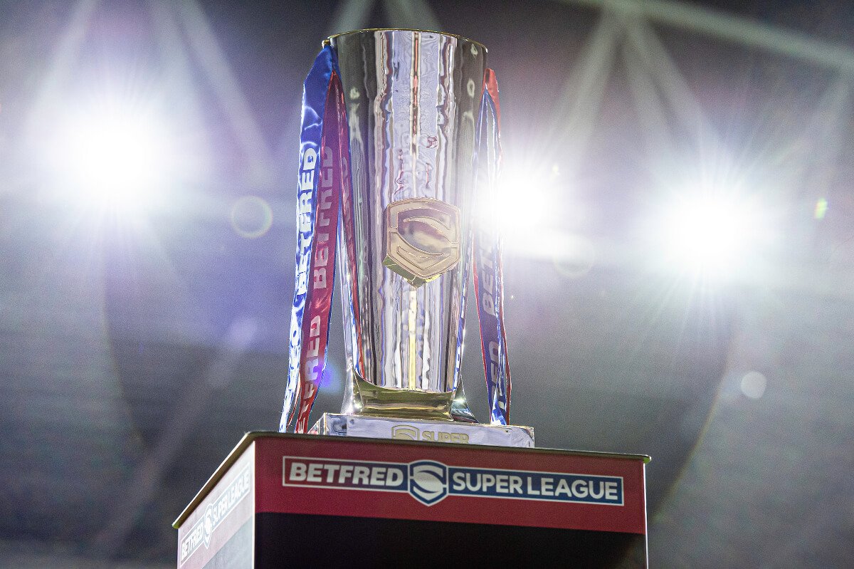
The new Super League season is nearly upon us and excitement levels for the new campaign are reaching new heights daily as we wait and see who the winners and loser of 2022’s instalment of Super League will be.
In some ways, we’ve already had some winners and losers however. With all 12 teams having revealed their kits for 2022, some have been received positively whilst others have unfortunately been met with dislike. But who has the best shirts going into the new campaign? We’re answering that by rating every Super League shirt released for the new season.
Castleford Tigers Home: 6/10
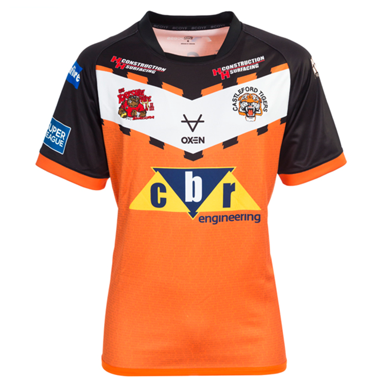
Following in the footsteps of Leeds, Castleford have begun a new partnership with Oxen and the England kit designers have had their first stab at a Tigers kit in the shape of the 2022 shirt. To the disappointment of most Cas fans, the shirt has adopted an orange base rather than amber. That said, there’s still a lot to like about this design not least the inclusion of the names of supporters who stuck by them during the pandemic. The black sleeves are a nice touch but what perhaps works against the shirt is the use of a white vee ahead of some strange looking black stripes.
Castleford Tigers Away: 6/10
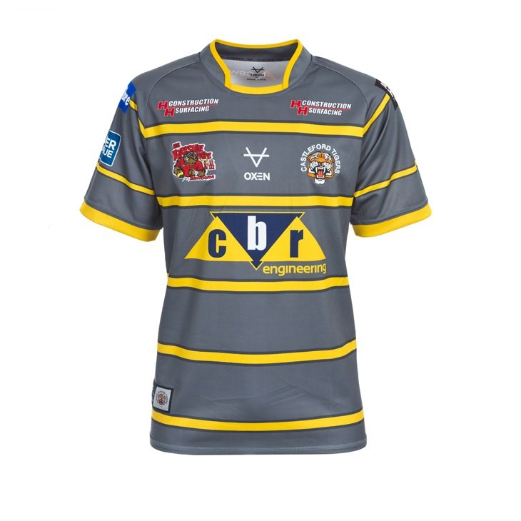
The basic principle behind Castleford’s away kit is good. The decision to go with a unique base colour with a series of stripes running down incorporating one of the club’s primary colours is a good idea. It’s just a shame that the grey base colour isn’t the greatest. The promotional pictures and videos depicted the kit in a way that made the colour look much more vibrant but in real life the jersey comes off as a bit dull.
Catalans Dragons Home: 9/10
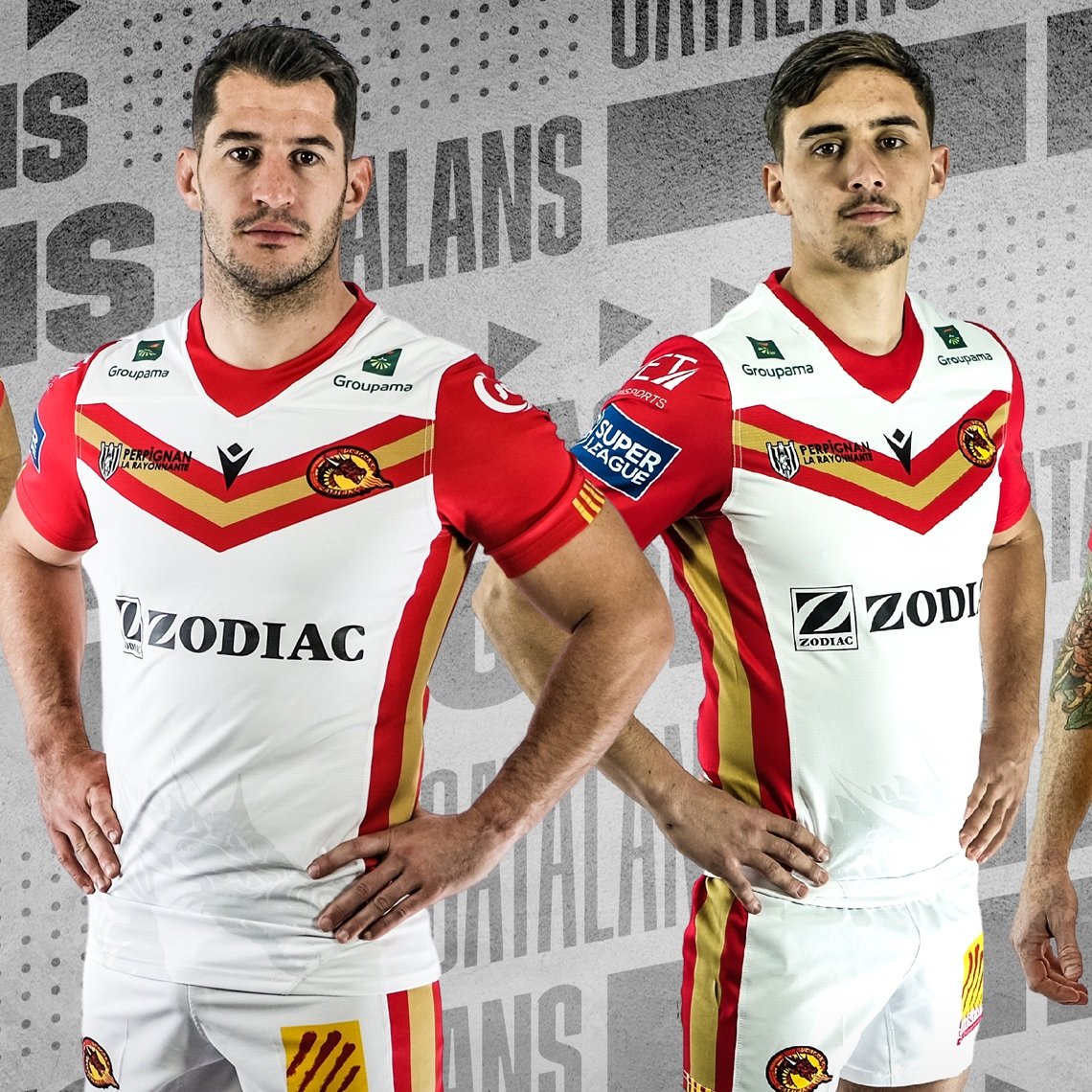
Catalans traditionally have nice shirts and in 2022 they’re continuing that trend. The jersey speaks to the blood and gold atmosphere which adorned their Super League semi-final triumph against Hull KR last season. The red and gold vee across the chest looks incredibly smart as does the red and gold detailing down the sides which adds something to a white kit which without it could have looked a touch dull.
Catalans Dragons Away: 8/10
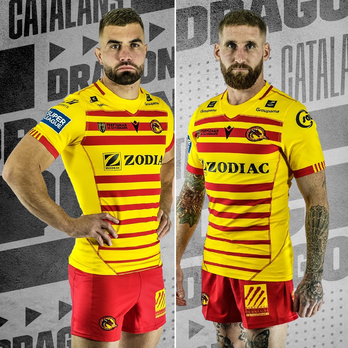
Catalans’ away kit certainly has some flair due to its vibrant yellow and red design. The colours themselves are what makes this jersey pop. However there is a couple of pieces of nuanced design such as the thinning stripes down the bottom of shirt and some unique detailing on the sleeves which only adds to this kit. The red shorts work nicely too and help complete the ensemble.
Huddersfield Giants Home: 8/10
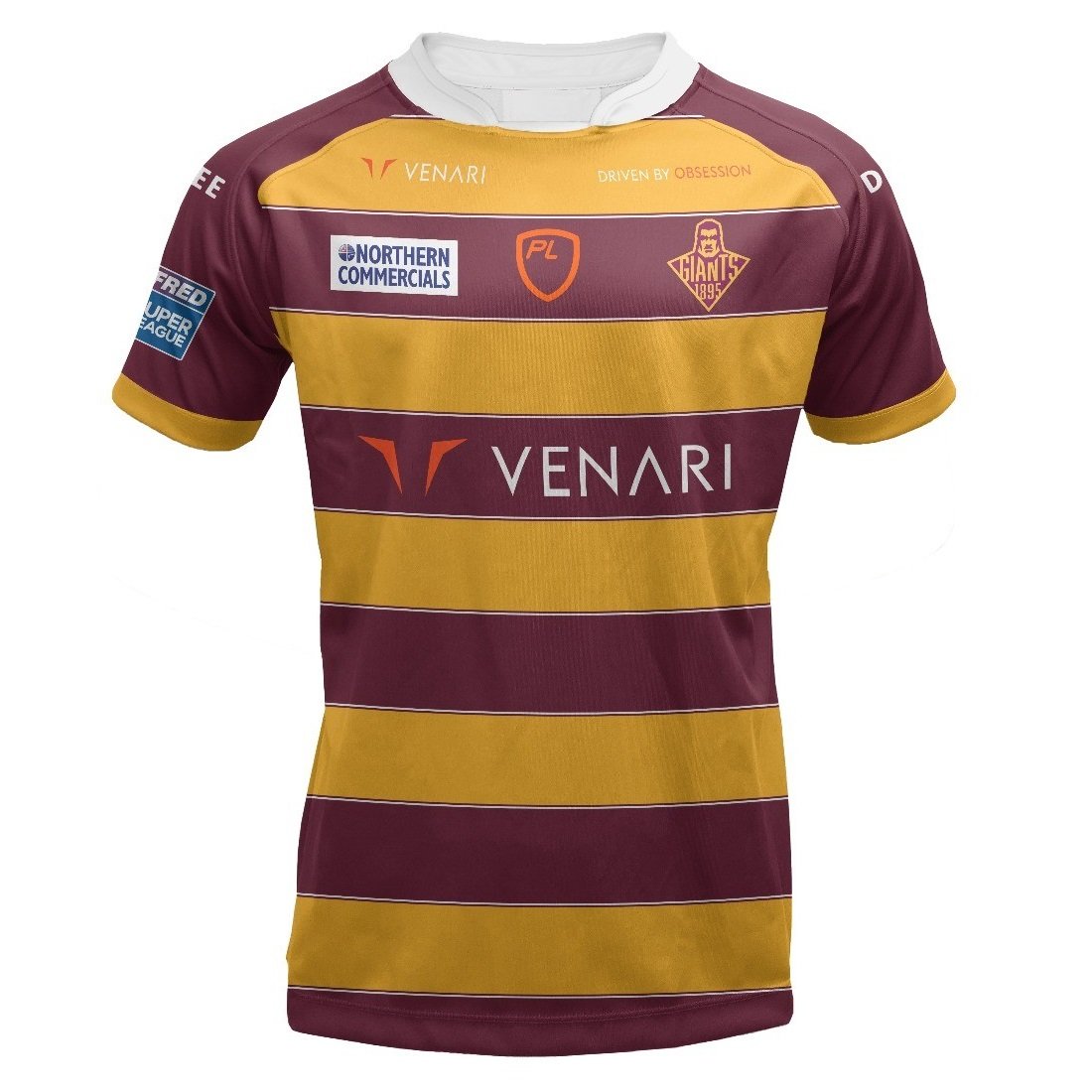
This is a smart shirt and is perhaps the quintessential Huddersfield Giants’ kit. The colours are strong and really catch the eye and this is helped by a simple design which brings the best out of the colours used. The intricate white detailing between each block of colour makes them stand out even more. The white collar is another nice touch.
Huddersfield Giants Away: 8/10
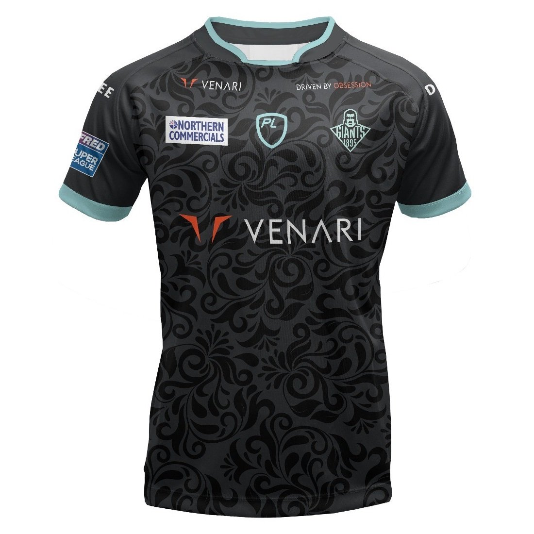
From a far this looks like a simple black jersey with some light blue detailing which itself sounds like a good idea for a kit and something different for Huddersfield fans to get hold of. However, the pattern within the black is what makes this jersey even better. Subtle yet intriguing, it adds another layer to an already nice shirt.
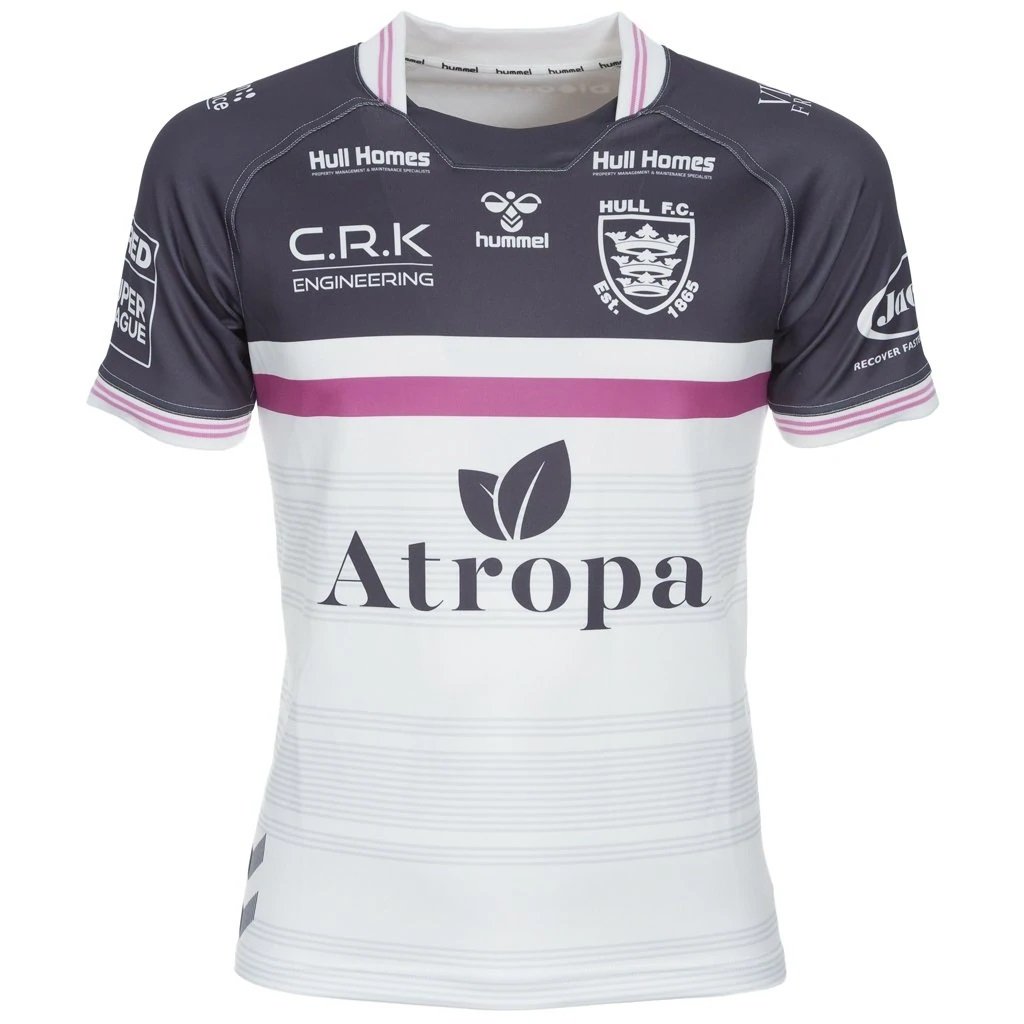
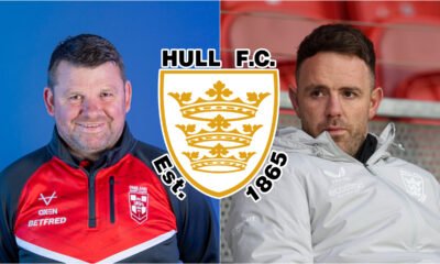
Hull FC Home: 7/10
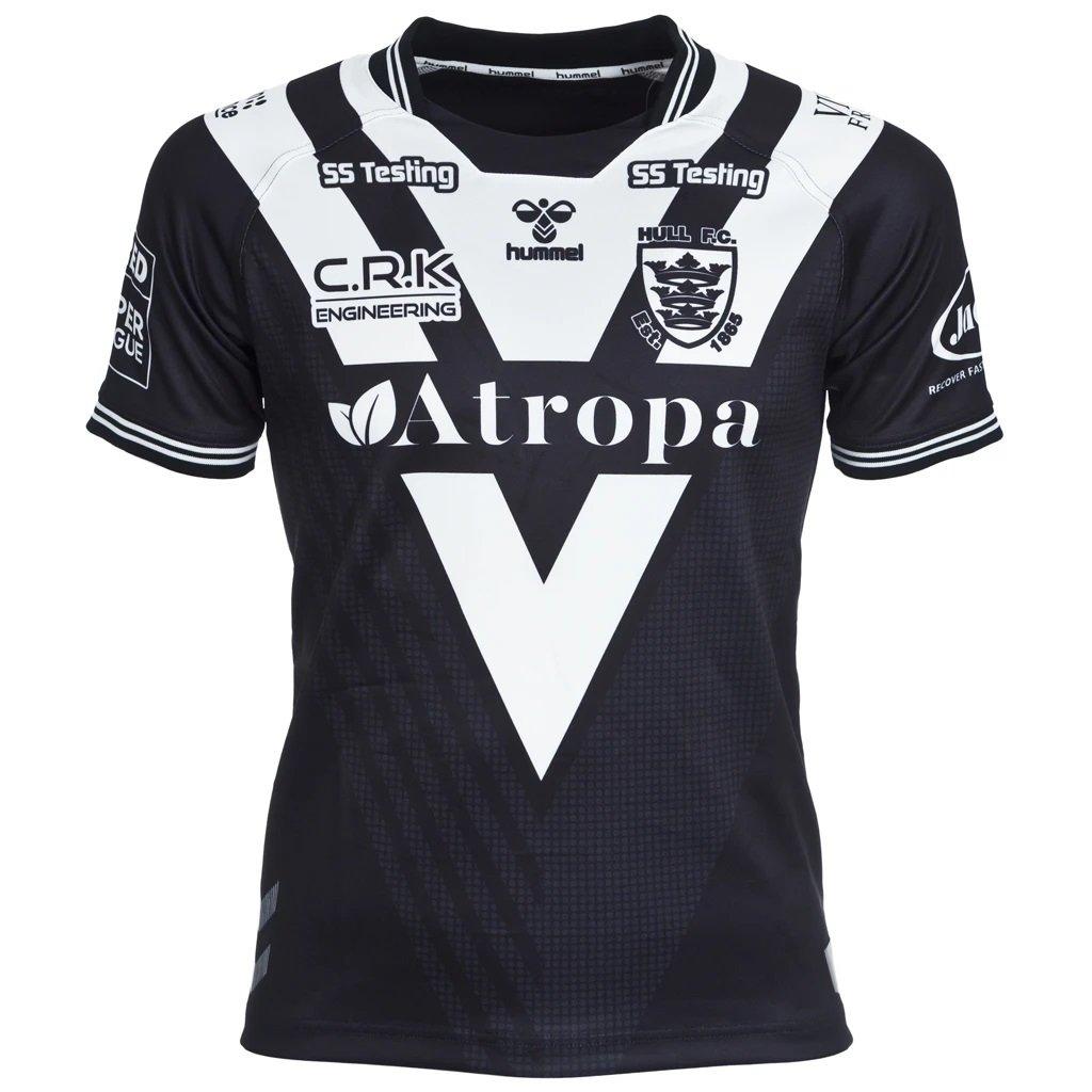
Hull FC shirts are at their best when they lean into sleek simplicity. Their black and white colour scheme lends itself it simple and smart designs, and their 2022 look fits the bill perfectly. The shirt is black with a pair of white vees making their way down the shirt. Using just two vees means the shirt doesn’t make itself overcomplicated whilst ensures it’s visually interesting enough to stand out. The faint detailing within the black also adds to this look whilst the white stripes at the bottom of the sleeves add to this classy design. However, I must admit that I miss the traditional stripes we associate with the club whilst the vees are perhaps too similar to New Zealand’s look.
Hull FC Away: 8/10
There’s something refreshing about a club using a couple of new colours in their shirt design to compliment tradition. The Black and Whites have a traditional white base but the grey and pink detailing is where this shirt truly excels. Across the chest the grey looks clean and bold and interacts with the pink masterfully. Meanwhile, the faint grey stripes only add to the kit as do the arrows at the bottom down the side.
Hull KR Home: 6/10
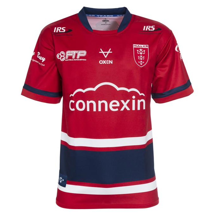
I want to give credit to Oxen for trying different things as they have done in the Castleford and Hull KR kits this year but, as with the white vee on the Castleford kit, the use of blue here doesn’t quite fit. Maybe if it had been higher up on the shirt it might have looked better. The base of the shirt is perfectly fine using a nice shade of red complimented by a blue collar.
Hull KR Away: 6/10
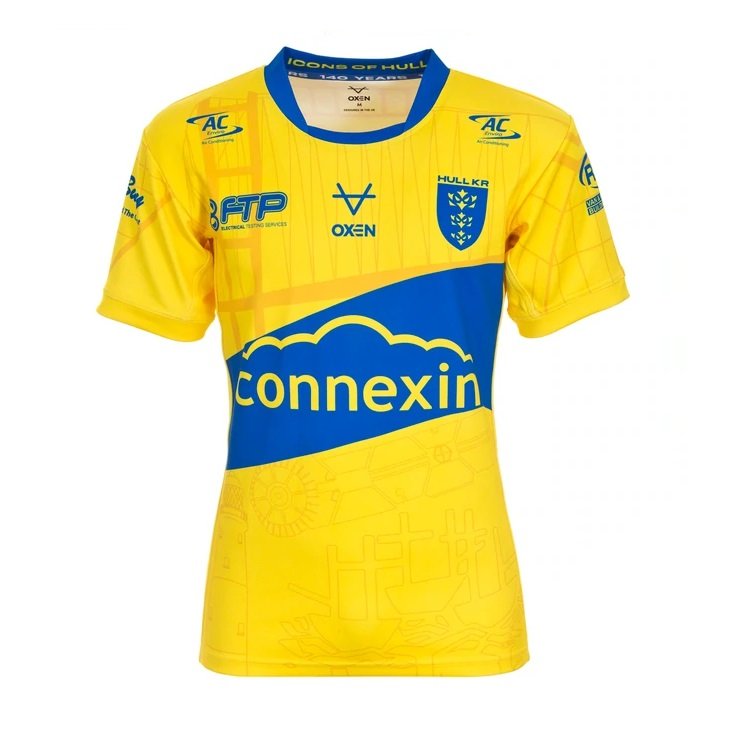
Once more I want to give credit to Oxen for trying something different. The colour pallet used as well as the introduction of images of landmarks and the use of a slanted stripe across the middle of the kit are bold steps, but when it all adds together it culminates in something a little too strange for my taste. I must admit I like the use of such a striking colour combination and the themes of the kit are something I think more teams should incorporate but perhaps it’s trying to do too much.
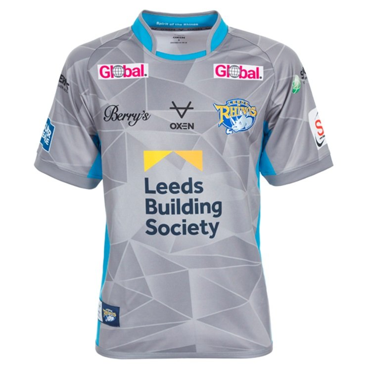
Leeds Rhinos Home: 9/10
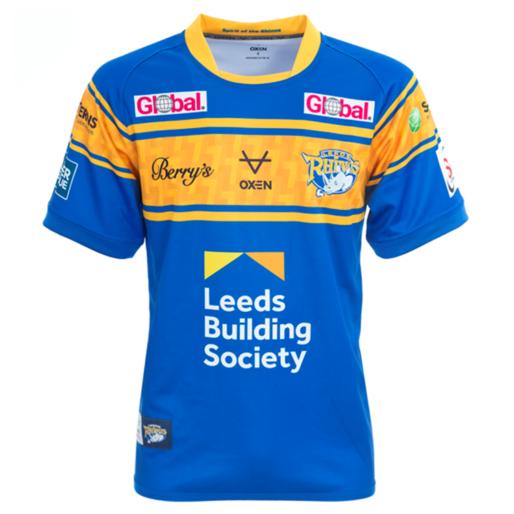
Leeds’ design in 2022 goes back to the traditional. After a much darker shirt in 2020 and a lovely yet unusual design in 2021 which used plenty of white, Leeds have gone back to their routes ahead of 2022. They’ve gone back to the three amber stripes which go across the chest like in the days of Leeds RL. We’ve seen shirts like this from Leeds in Super league before such as in 2005 and 2018, but this is arguably the best modern iteration of the design. The colours are perfect as they balance tradition with vibrancy masterfully making the shirt pop. This design misses out on 10/10 due to the lack of creativity in its basic design as it dips back into the past with little going on within the blue. However, it’s absolutely a 9 thanks to the quality of the overall look and the lovely, wholesome touch of weaving Rob Burrow’s number seven into the amber stripes. Just as the seven is woven into the pattern, Burrow is forever woven into the history of the club.
Leeds Rhinos Away: 9/10
Rhinos are spoilt for choice with two lovely shirts for the new season. The away shirt is certainly different from what you might expect Leeds to wear with a grey base complimented by a lovely light blue down the sides of shirt and the collar. Adding to the design, the grey of the shirt is broken up into strange shapes which makes what would have been perhaps an overly simple shirt into a shirt which offers something totally new to the Rhinos faithful. Together this new direction alongside Leeds’ traditional home shirt gives the Rhinos perhaps their best selection of shirts for some time.
Salford Red Devils Home: 7/10
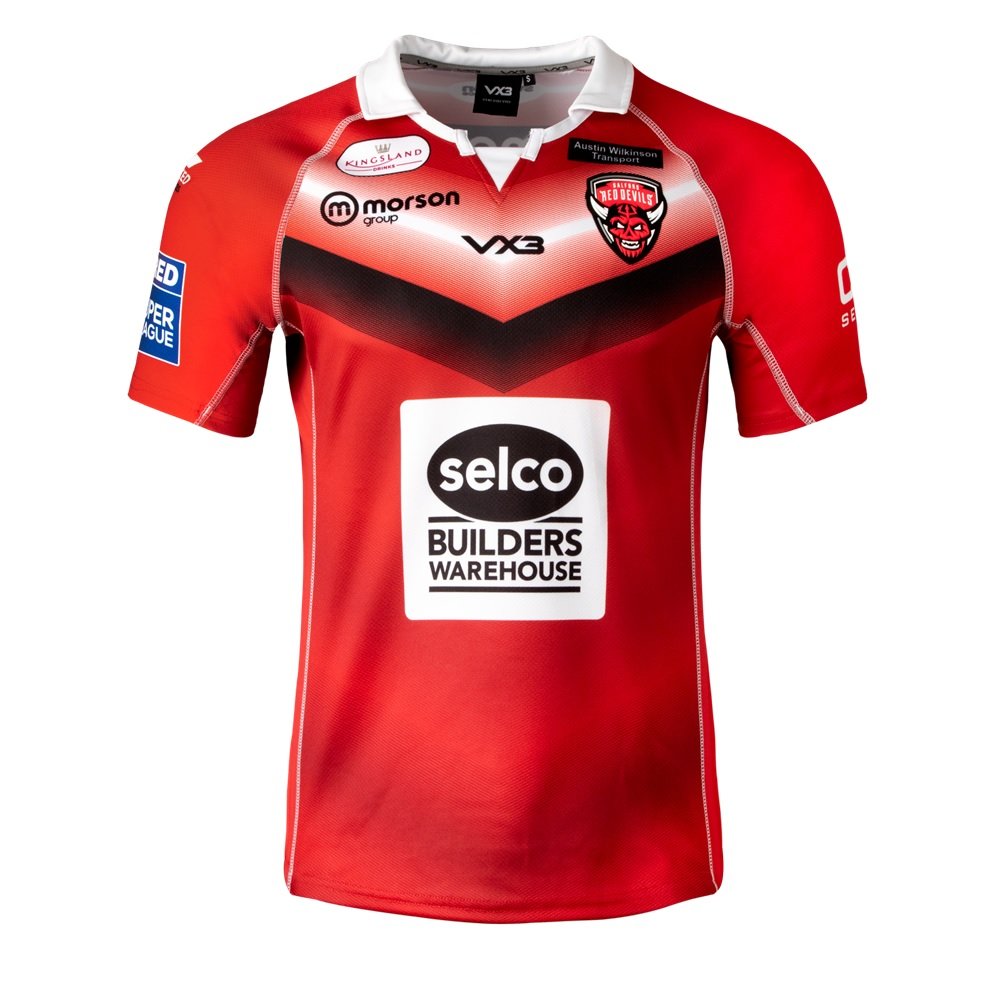
This shirt receives a seven because it is perhaps the quintessential Salford home shirt but little else beyond that. It’s a smart shirt and uses a nice shade of red and the vee across the chest is a nice touch but it loses marks for creativity with the shirt not attempting to do much that could be considered ground-breaking.
Salford Red Devils Away: 7/10
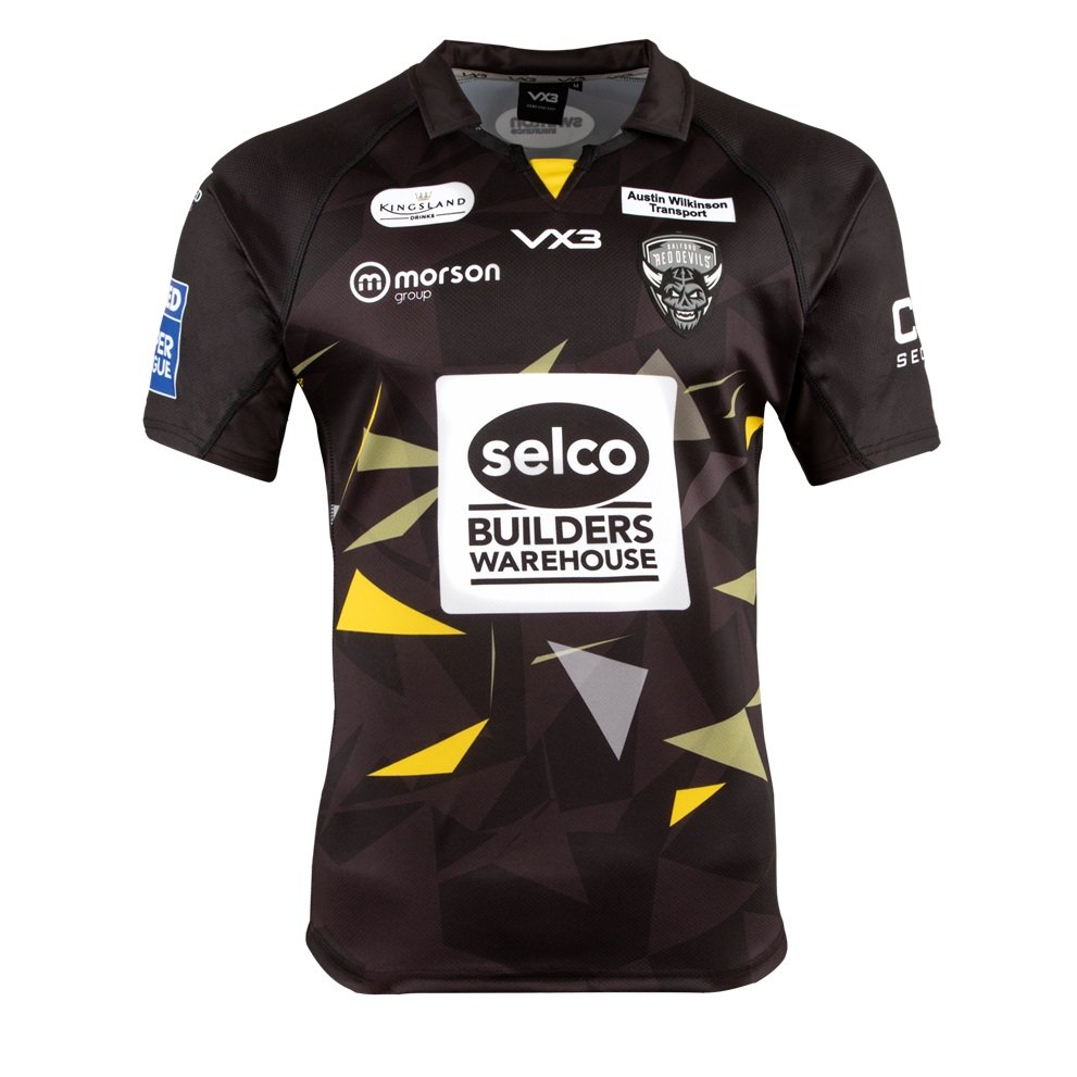
This shirt perhaps has the opposite problem. It tries to do something too unique with a number of triangles dotted around the shirt some of which are coloured. In being so wild it loses the smartness that the home shirt possesses. This jersey perhaps needs a touch of nuance and perhaps should do more on the sleeves.
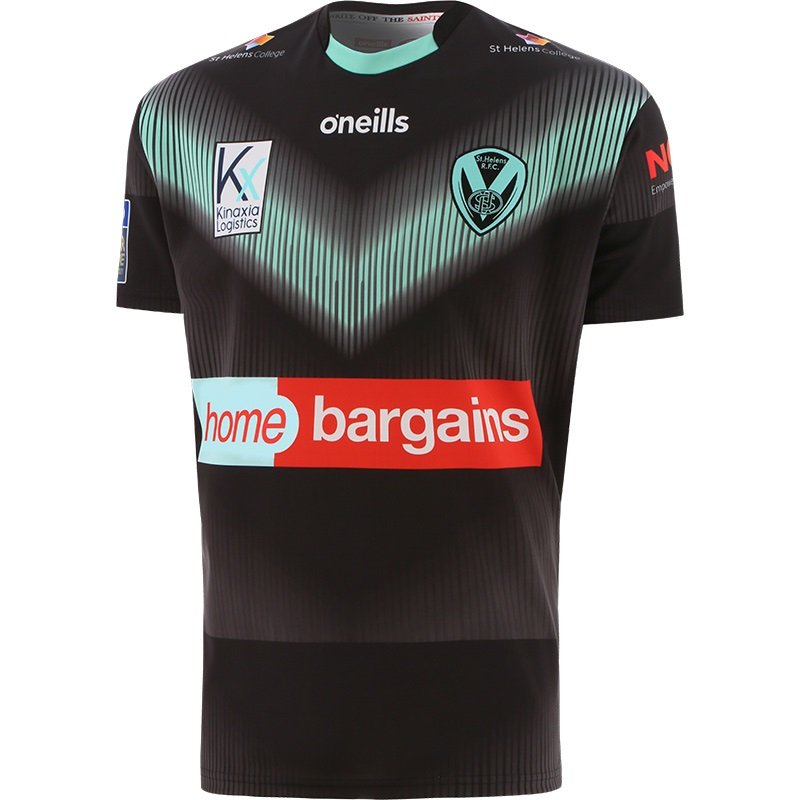
St Helens Home: 6/10
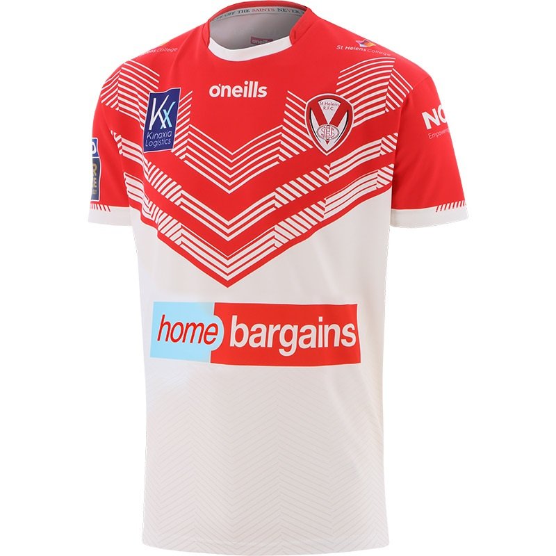
St Helens have had some of the nicest home shirts of the past few years, but their 2022 jersey isn’t quite to my taste. I appreciate the effort to put a spin on St Helens’ traditional design with lines woven into the white of the shirt whilst the red vee contains white vees made of changing designs. Ultimately, however, I believe the shirt would look smarter if it maintained its basic principles and didn’t put such a spin on it. If it ain’t broke, don’t fix it.
St Helens Away: 7/10
Like St Helens’ home shirt, their away shirt tries to do something unique but it comes off a little better. After all, away shirts are often the best place to experiment. The use of a mint green vee and badge is a bold one, however I think St Helens’ traditional blue, which often features on their away shirts, could’ve come off a little better. Furthermore, I feel there’s too much going on within the black.
Toulouse Olympique Home: 8/10
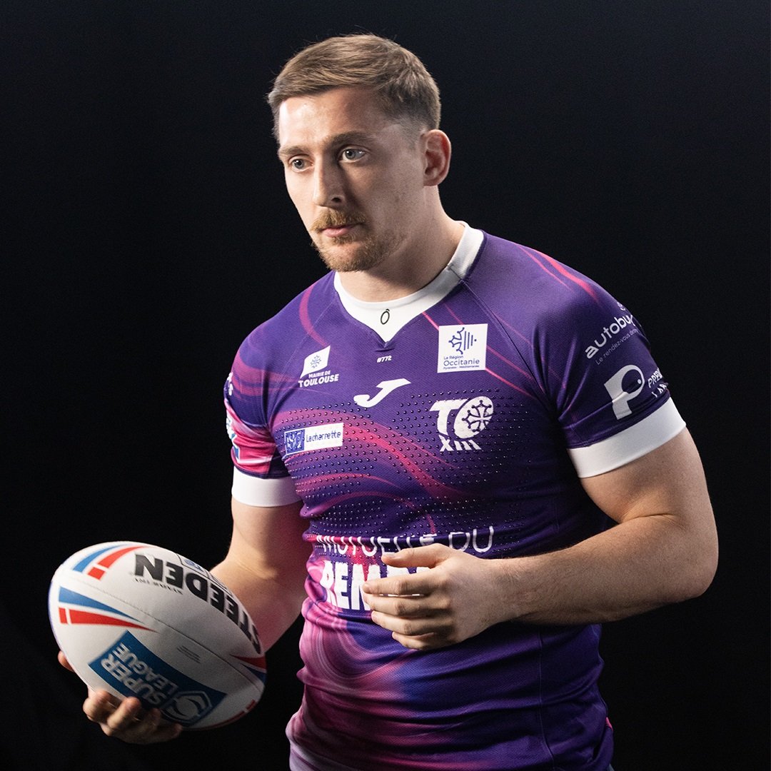
A departure from Toulouse’s traditional colours, their 2022 kit is something unique and eye catching. The shades of pink and purple are somewhat different to anything we’ve seen in Super League for some time and the design of the shirts makes them pop even more with the pink having a paint like texture to it as it weaves in and out of the purple. This is certainly a visually stimulating shirt.
Wakefield Trinity Home: 7/10
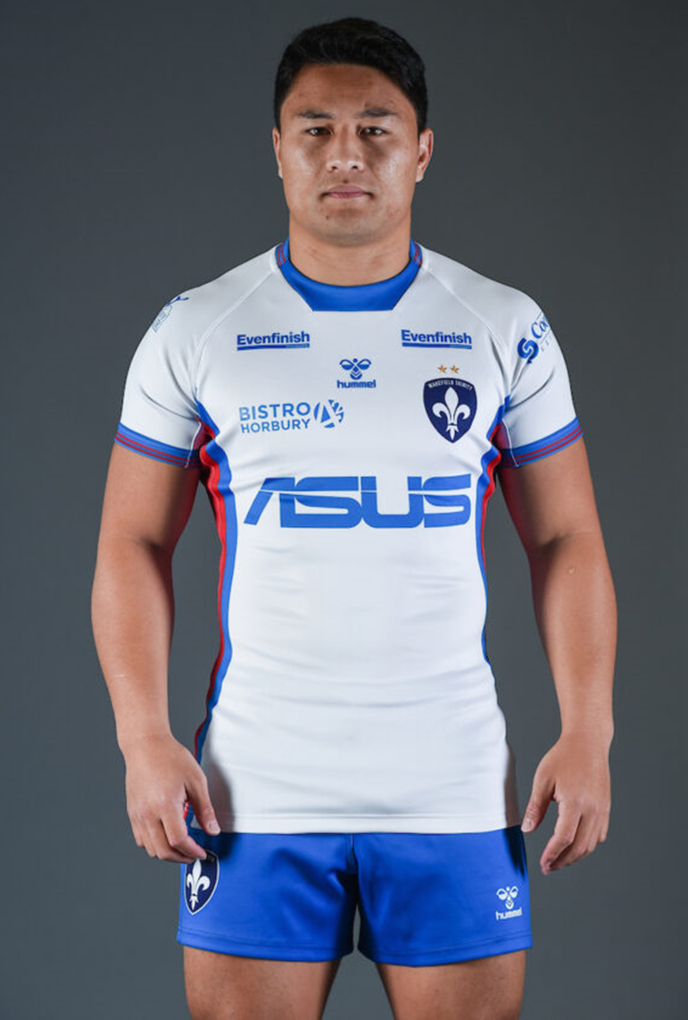
We should give credit to Wakefield for trying something different going into 2022. They’ve attempted to give themselves a much sleeker and perhaps modern shirt going into the new season and again have continued their trend of keeping supporters on their toes by changing the base colour of their home shirt year on year. That said, the design looks a touch empty to me and strays away from what has often given Wakefield the best shirts in recent seasons and the same could be said of the badge as the club goes in search of a modern, sharper look at the expense of tradition. However, I might be old fashioned. Perhaps this is the future of Super League shirts.
Wakefield Trinity Away: 7/10
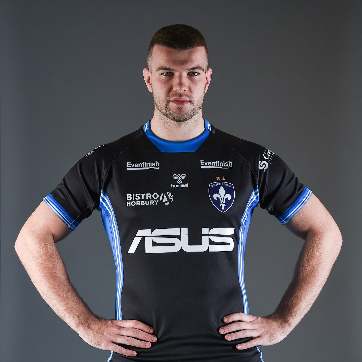
This is very much the same as the home shirt with the white substituted for black – a sound idea to create too contrasting shirts. It also creates a theme for Wakefield in 2022 which is something I always think works. But, much like the home shirt, there appears to be very little going on in this jersey. However, it has to be said that the blue and white detailing down the sides is a nice touch.
Warrington Wolves Home: 8/10
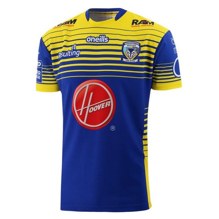
Warrington’s 2022 home shirt balances modernity with tradition wonderfully resulting in a lovely new jersey for the new season. The Wolves utilise the stripes we often see on their shirts but add a twist to the design. The chest area is primrose broken up by a series of blue stripes which progressively get thicker before the shirt transitions into a lovely bold blue. The stripe effect features on the sleeves as well but this time with the blue fading into primrose. Meanwhile, this lovely shirt is further adorned by yellow down the edges of the shirt.
Warrington Wolves Away: 10/10
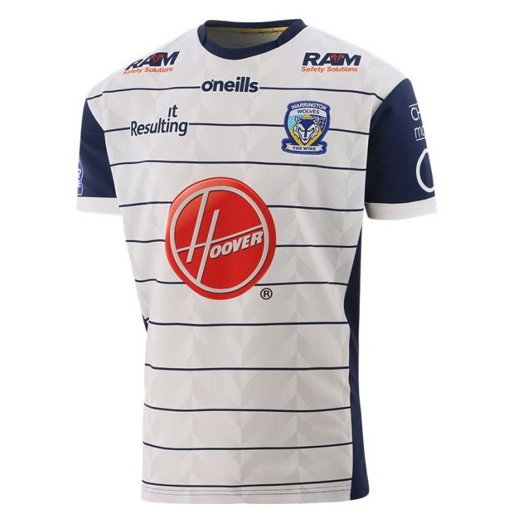
There’s nothing I’d change about Warrington’s new away shirt. The relationship between the sharp white base of the shirt along with the lovely dark blue which runs down the sides of it and features on the sleeves, is incredibly smart and sophisticated. The sleeves look even sharper due to the band of white at the bottom of the dark blue which also finds itself on the shirt proper forming thin, smart stripes which cover the entire jersey creating a simple and smart look.
Wigan Warriors Home: 9/10
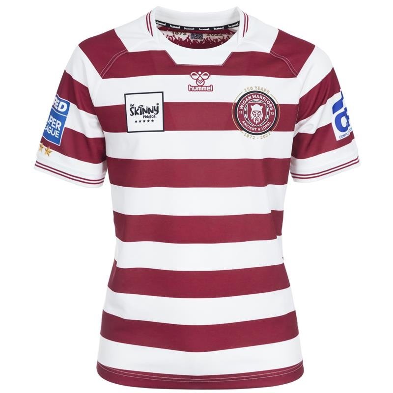
Wigan’s kits are at their best when they’re simple and follow tradition and their 2022 shirt certainly does that. Everything about this shirt works together to create a simplistic yet smart design that feels like the quintessential Wigan shirt. I also think the shade of red is a nice touch and works nicely with the white to create something striking.
Wigan Warriors Away: 9/10
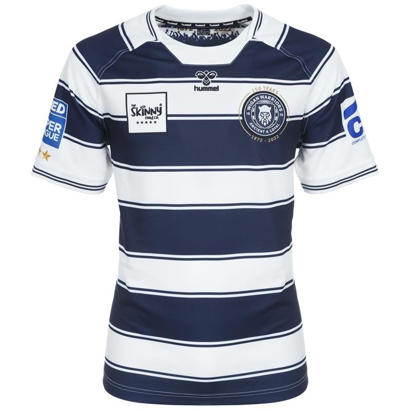
This shirt adopts a very similar design to the home shirt but swaps the red out for a lovely shade of navy blue whilst adding thinning stripes either side of the main blue stripes to add a little something extra to the kit. Again following tradition – Wigan have often played in blue and white striped away kits – it manages to take history and bring it into the modern era with a lovely use of colour and a simple yet smart design with a few touches of creativity here and there.
2 Comments
Leave a Reply
Leave a Reply


Leigh Leopards
Former Leigh Leopards star Blake Ferguson sacked

Warrington Wolves
Sam Burgess makes decision on future following South Sydney links

Huddersfield Giants
Jake Connor takes swipe at Leeds Rhinos fans


SubEditor
February 6, 2022 at 8:03 am
More complimenting when it should be complEmenting :=)
Maybe the web-master could introduce an automatic spelling corrector to spare the site from the slovenly spelling of the contributors.
SubEditor
February 6, 2022 at 8:12 am
“nice”, “nicest”, “too unique”.
So this is where the O-level English failures eventually end up. I always wondered.
As for the shirts, I like the Catalans designs. The rest (particularly Castleford) have neither the virtue of style nor of simplicity. There are a couple that look like an explosion in a paint factory. Overall, 3/10 by my standards.