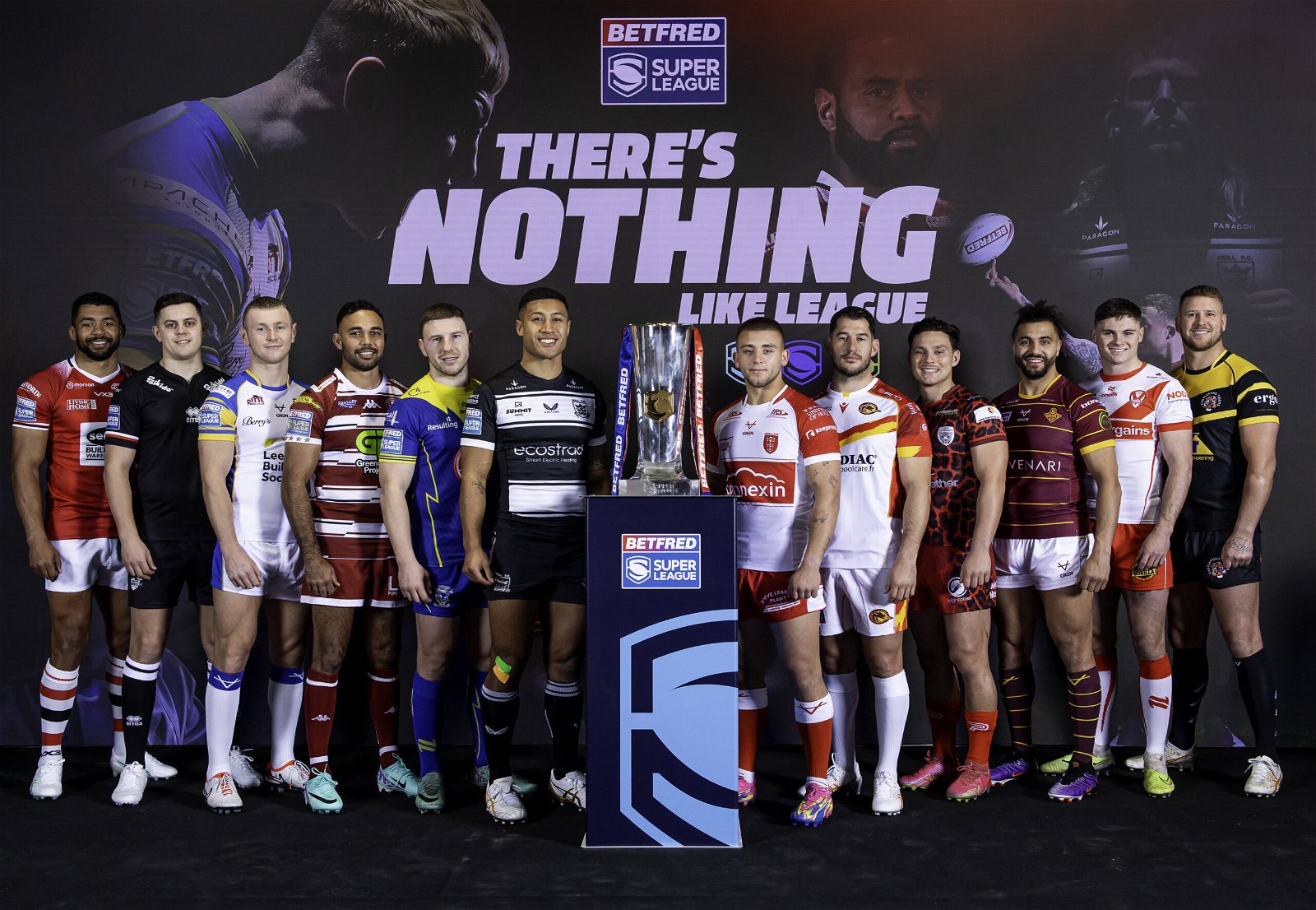
Every year brings us a new batch of Super League shirts to be worn for a season, and every year, people get excited and/or angry about their team’s offering.
Every year, people attempt to rank them as well – and that’s what we’re doing.
Below are all twelve 2024 Super League home shirts, ranked by SARL.
12. Leigh Leopards
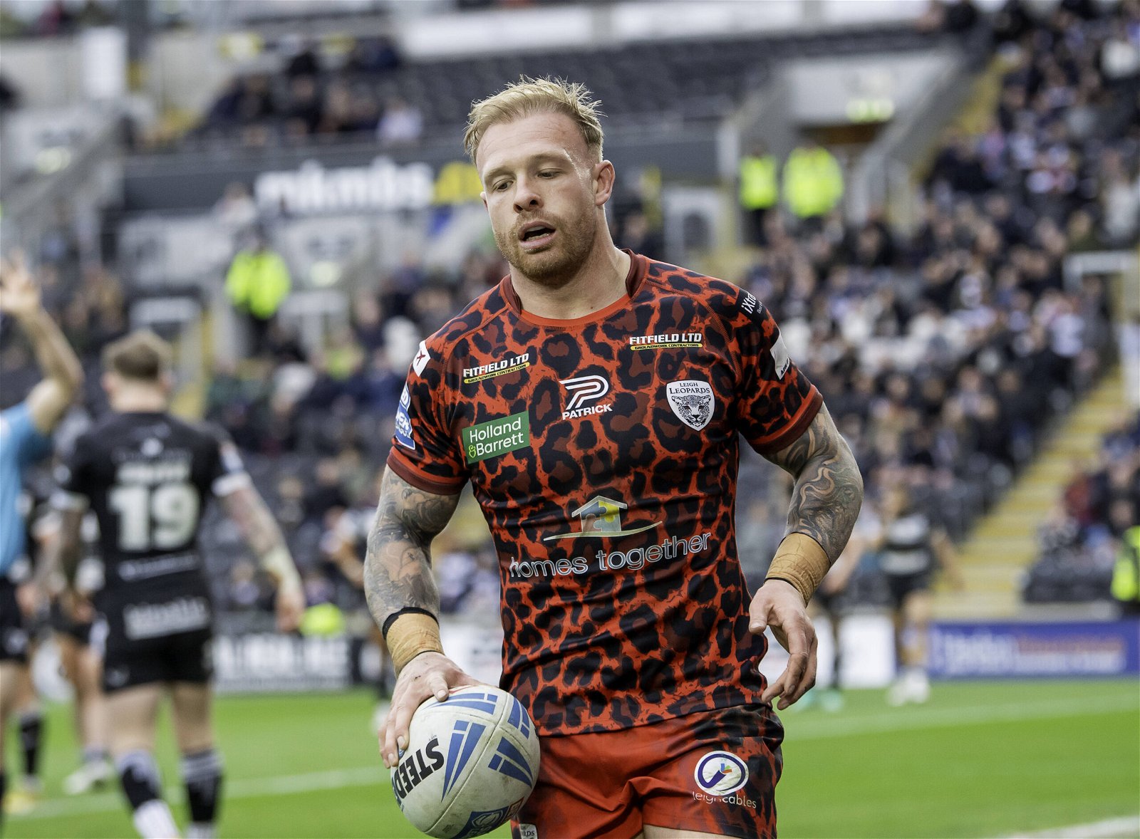
Credit: Imago Images
Ouch. Sorry, maybe we just don’t ‘get it’ but this looks really bad.
The print itself leaves a lot to be desired, but the sponsor logo also seems to put together all the worst colours together in… a jigsaw.
Leigh grab the title of the worst home shirt in Super League for the second year running.
11. Warrington Wolves
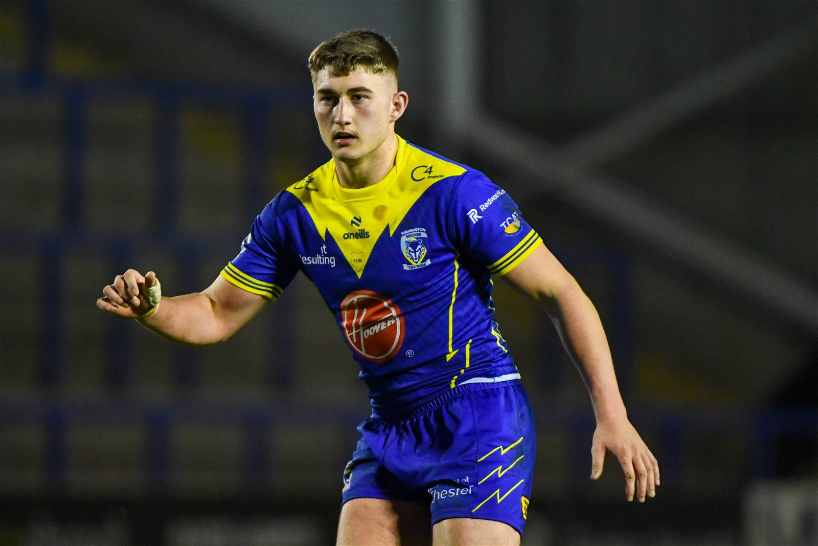
Credit: Imago Images
Really wanted to like this.
Warrington say the yellow bit at the top is ‘mirroring the contour of the lower-third of the wolf’ in their logo, and that idea is awesome – it’s just not done very well.
Sorry.
The Hoover logo is horrible, but the yellow jagged lines (the wolf shape again) down the sides (and on the shorts) are great. Should’ve stuck to those.
Cool badge, cool idea, not quite there.
10. London Broncos
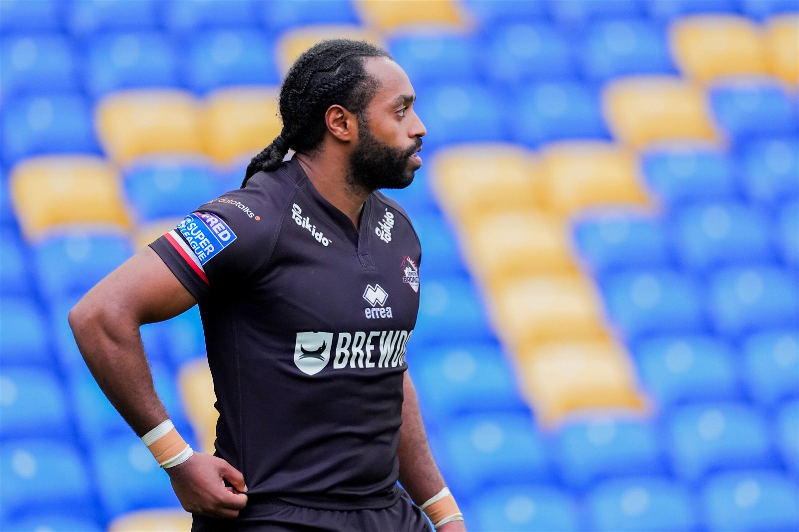
Credit: Imago Images
Nothing against plain, classic kits, but this just doesn’t really do it for us.
Everything seems a bit too low down (the collar doesn’t help) and plain black isn’t really even a classic kit for the club.
Nice idea, could have been great, but ultimately didn’t really work.
Plough Lane has been graced by some all-timers over the years, but this probably won’t be one of them.
9. Salford Red Devils
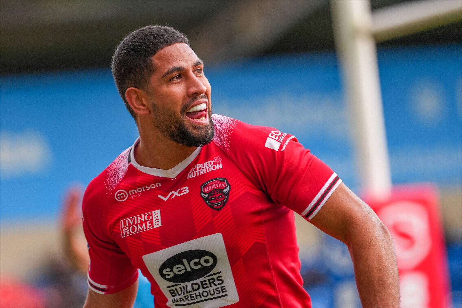
Credit: Imago Images
Fair enough, the all-red look is classy and the subtle print across the shirt is nice.
However, the strange gradient coming off the collar makes it look like it’s disintegrating and the sponsor logo also doesn’t fit the ‘classic vibe’ that you kind of need from a plain shirt to make it work.
8. Leeds Rhinos
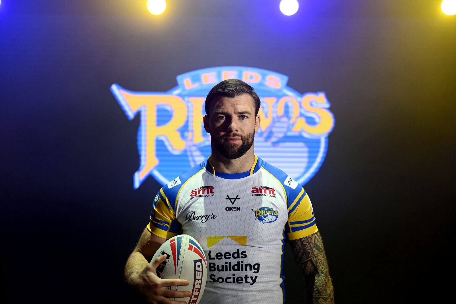
Credit: Imago Images
It’s white.
???
Leeds Rhinos shirts should be blue and yellow, sorry. Is this an attempt to bring in Leeds United fans?
Sorry – they won the 1910 Challenge Cup in white, so it’s okay.
Either way, it’s close to being a nice shirt in itself but it’s all a bit odd – the yellow on the sleeves looks wrong, the blue down the sides looks wrong…
Can’t quite place it, but there’s something odd about the whole thing.
And not just that it’s white.
7. Wigan Warriors
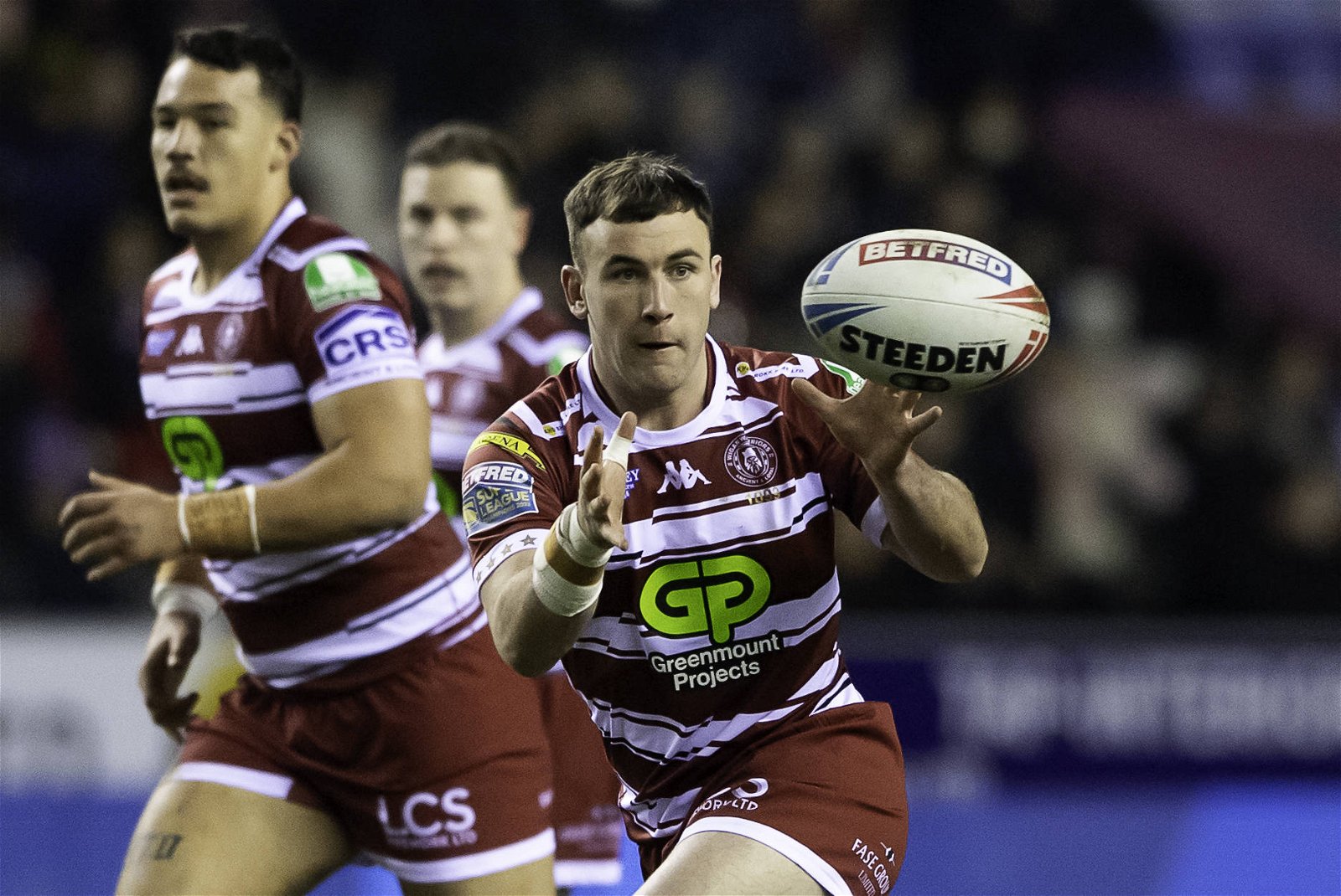
Credit: Imago Images
The World Club Challenge shirt was lovely. we know it wasn’t quite cherry-and-white, but it looked so sleek.
This one looks a bit like the file was corrupted, but it’s an interesting take on stripes.
It’s not horrible by any means, and could potentially have placed higher if the sponsor logo wasn’t so aggressively green.
Is it worthy of the Super League champions? Not sure.
P.S. The third shirt is awesome.
6. St Helens
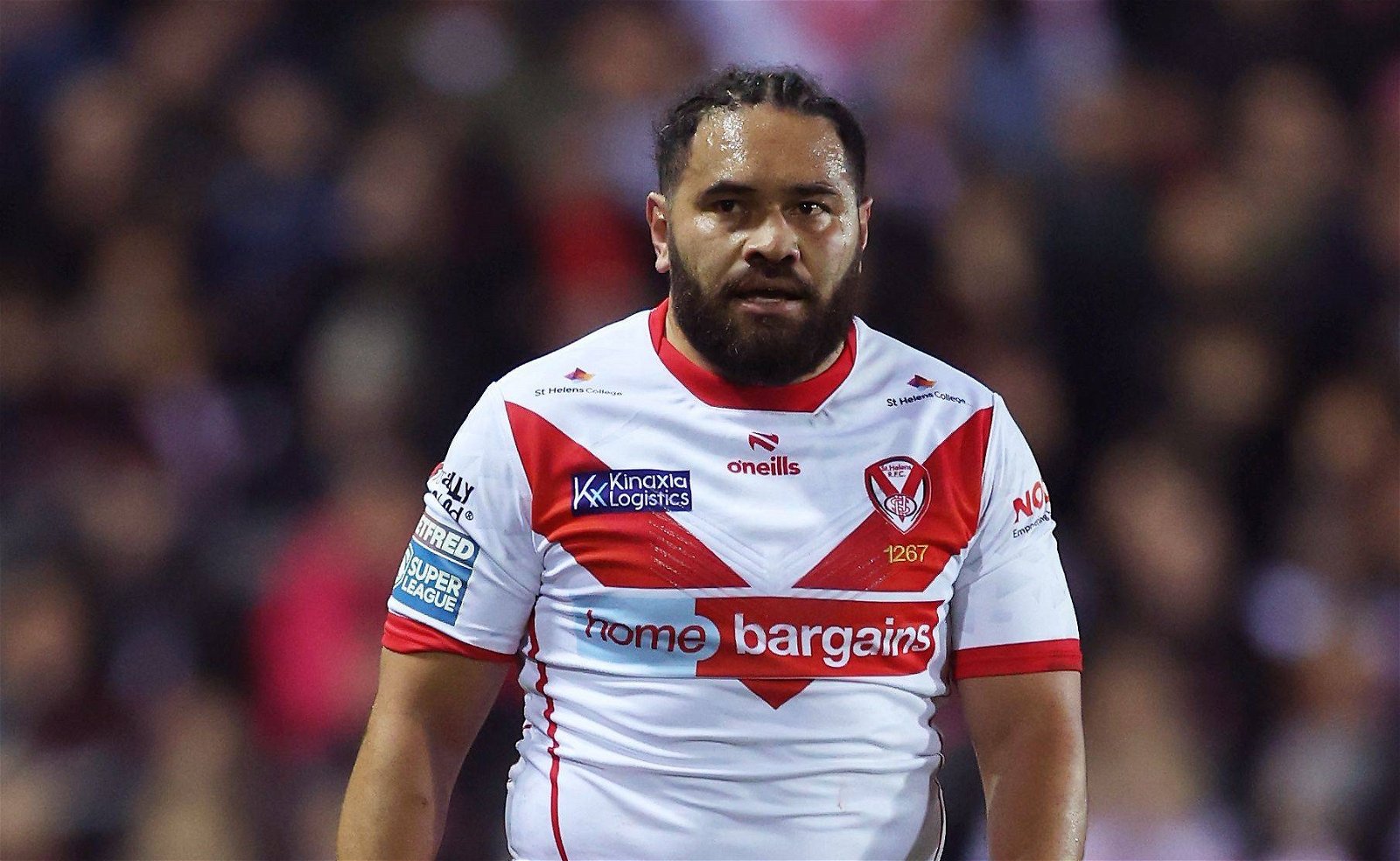
Credit: Imago Images
It’s simple, but in a good way.
The red V is iconic, and you don’t have to do a lot with it.
Slightly disappointing that it’s just a slightly-worse 2023 shirt – it was basically the same, just with a nice overlapping red and white collar and sleeve cuffs to match.
It could be higher, but it’s got the Home Bargains logo on, and it’s way too big.
Nice work from O’Neills though. They have to work with what they’ve got.
5. Hull FC
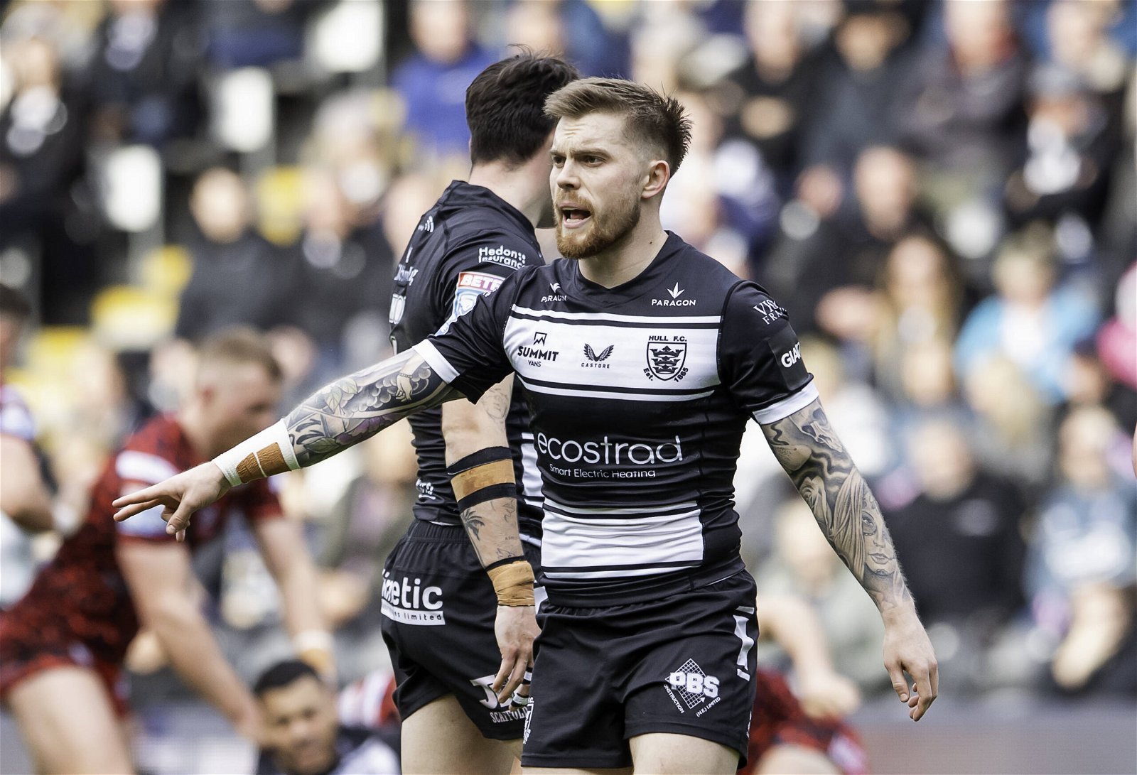
Credit: Imago Images
Mostly black this time, and it’s really nice. Castore generally do a good job.
The only issue? The sponsor seems to be ever so slightly too low.
It throws us off. Otherwise, lovely.
Oh also, though, the stripes get cut off too suddenly. Feels like they should go at least half-way around.
4. Hull KR
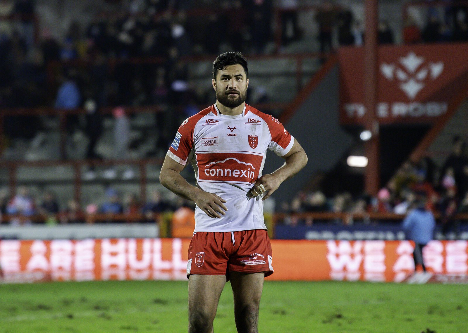
Credit: Imago Images
Oxen, Oxen, Oxen… you were so close.
Again – why does that stripe get cut off before the side panels??
It’s upsetting, because otherwise, this is really nice.
Yes, we were a bit mean about the Leeds shirt being white, but the KR break from tradition is a little less jarring.
The shorts work really well, too.
3. Castleford Tigers
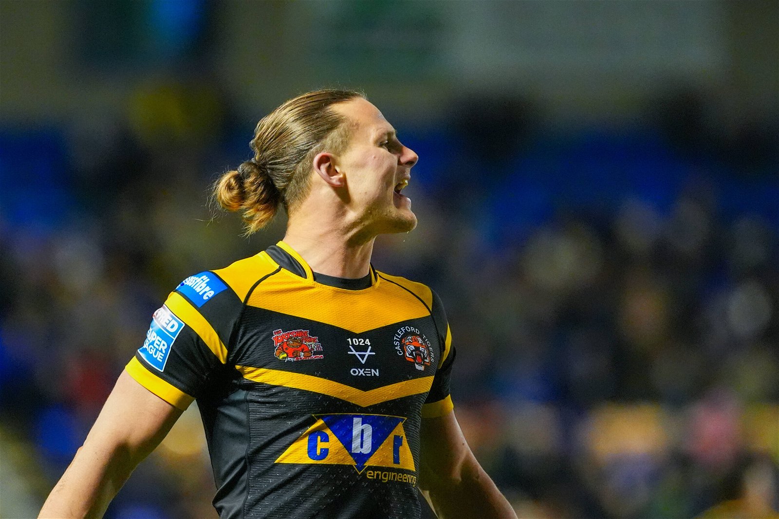
Credit: Imago Images
This is a masterpiece (said in the least biased way possible).
It’s so simple – essentially just block colour and a classic chevron – but really good.
It’s only issue is that it looks like the perfect Castleford away shirt.
Yes, they’ve worn black at home a lot over the past few years, but that’s wrong too.
Billing it as ‘amber is back’ is a bit like calling the Wheldon Road toilets ‘toilets’ – technically, it’s true… but it’s only just true.
Anyway – as a shirt in itself, it’s wonderful.
2. Catalans Dragons
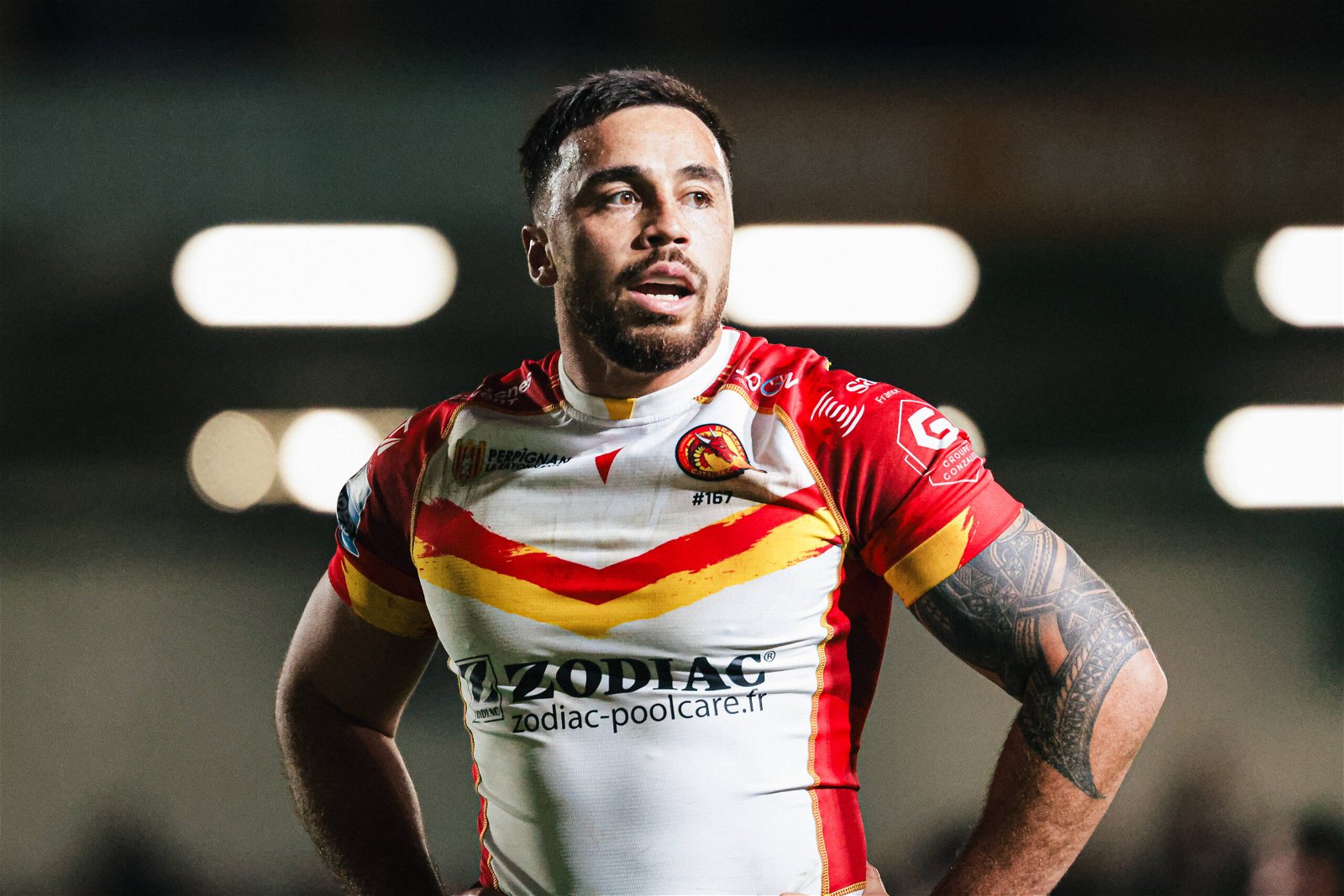
Credit: Imago Images
Can we please all take a moment to thank the Catalans Dragons for their services to rugby league shirts over the years?
Also – whoever designed the flag of Catalonia. It’s wonderful for this kind of thing.
Once again, Els Dracs are the coolest-looking team in the league.
The brush-stroke thing is a little odd but it’s not easy to tell it’s there, and the overall idea is great.
There’s more red than usual, but it works!!
The only criticism we have is the random tiny bit of yellow on the collar at the front. What’s that all about?
Magnifique.
1. Huddersfield Giants
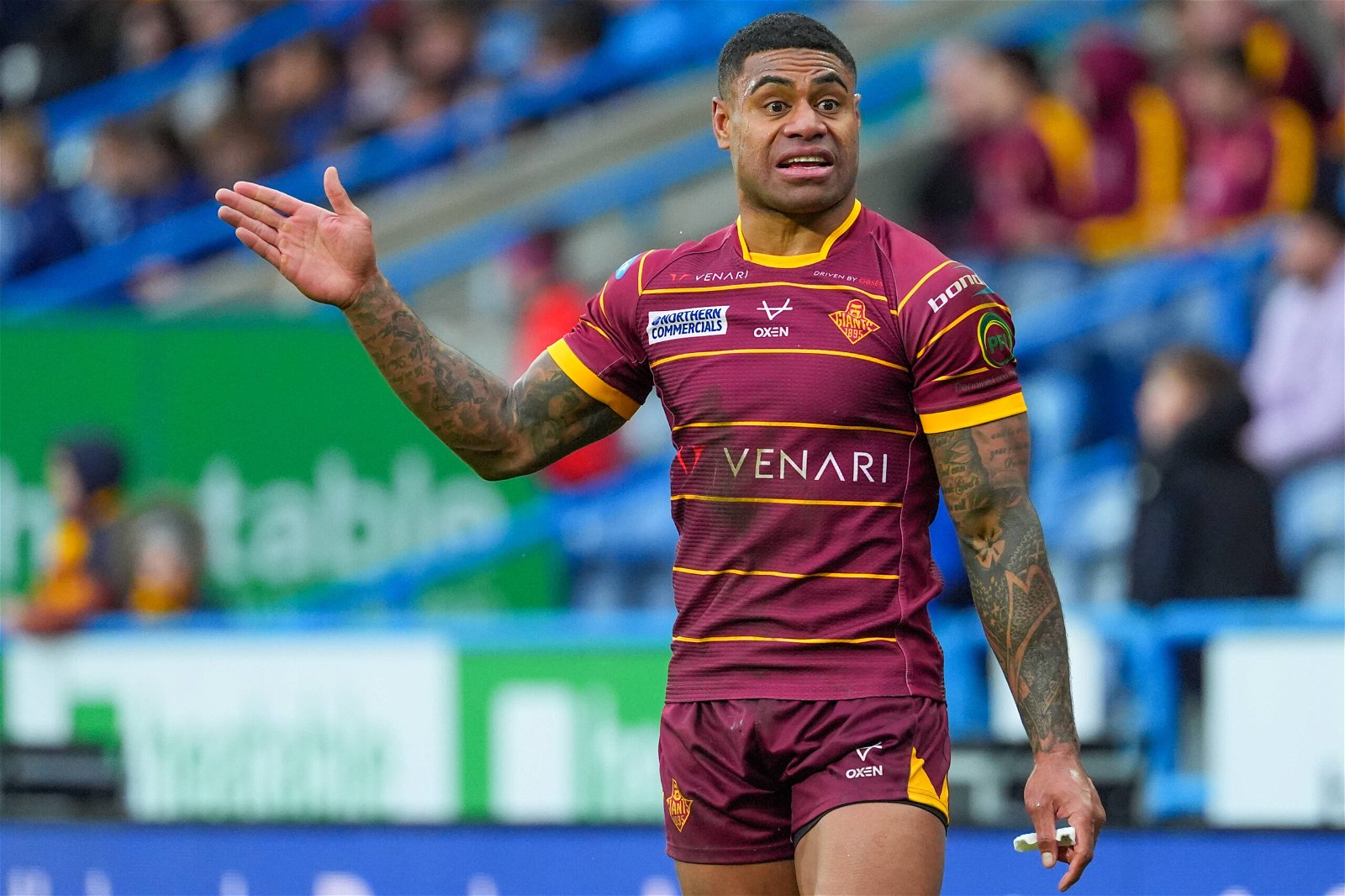
Credit: Imago Images
This might be controversial, but man, we love this.
The pinstripes are great, although it’s a shame they don’t continue on to the back.
It just all looks so classy.
The sponsor logo should maybe be between the second and third stripes, rather than the third and fourth, as it looks a bit low currently, but that’s a minute detail really.
This one is top dog, takes the cake, smashed it out of the park.