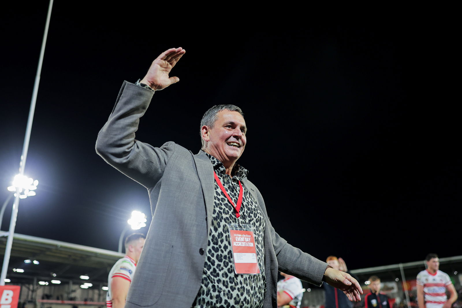
It’s less than a week since Derek Beaumont made the bold decision to rebrand his beloved Leigh Centurions as the Leigh Leopards.
A bold decision, it was one that more than divided opinion but Beaumont needs to be commended for the way he has used it springboard themselves into the headlines and all over social media.
Beaumont has helped this by sharing almost daily different takes on the Leigh Leopards logo sparking debate on the internet.
So, we’re assessing every iteration of the Leigh Leopards logo we’ve seen.
1. Original:
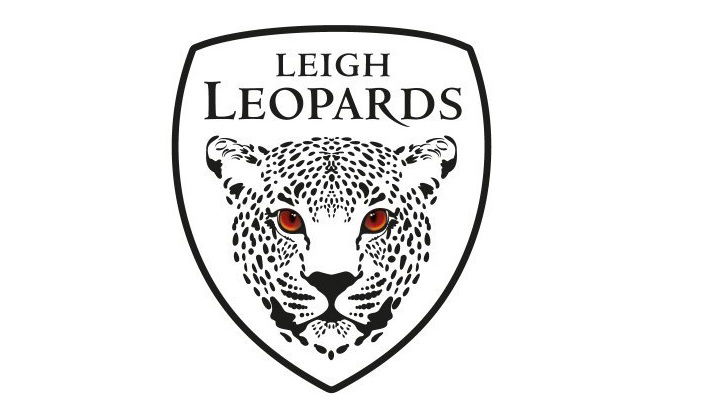
This first logo is the original released at the launch. The shape of the logo, which is consistent throughout, is a great look for any sporting institute and the focus placed on the name at the top is brilliant. It is the Leopard itself that many have been unimpressed with but that is now the identity of the club. The eyes are a nice touch sustaining the red at the heart of the club however they could be more vibrant as could the overall look of the badge. Verdict: 6/10
2.
Morning @LeighRLFC_ hope everyone has a fantastic day! Get down to @lsvstadium to watch the @RLWC2021 will be tuning in from Orlando! Good luck to Ireland and Lebanon and especially @BrandKeanan @EdChambo96 @RobbieMulhern 🏉🏉 pic.twitter.com/ZlRVQ4aNik
— Derek John Beaumont (@derek_beaumont) October 23, 2022
The first one Beaumont shared on his personal account addressed that vibrancy issue with the bottom of the Leopard fading into red. Meanwhile, the name of the club is in red adding some much needed colour to the look. Verdict: 7/10
3.
Good morning everyone and in particular our @LeighRLFC_ fans! Hope you have an amazing day! Can’t believe I forgot to pack my shaving foam! 🐆🐆🐆😎 pic.twitter.com/3hdQLfTsKw
— Derek John Beaumont (@derek_beaumont) October 24, 2022
The third iteration took a backwards step. It removed the red fade from the top and from the lettering but kept it at the bottom. It just subtracts a little colour from the look. Verdict: 6/10
4.
Good morning @LeighRLFC_ have a great day everyone 🏉 pic.twitter.com/72AoARghxr
— Derek John Beaumont (@derek_beaumont) October 25, 2022
There’s something really artistic about this one. A cream background, a red leopard and no border. Why I appreciate the colourfulness of this look, it is perhaps a logo that wouldn’t be best suited on a kit but rather on the more professional side of the club. Verdict: 7/10
5.
Good morning @LeighRLFC_ hope everyone is having a great day and look forward to the critics giving us exposure to their followers! We really appreciate it! Have a great day and be your kindest and your best 🙏🏉❤️ pic.twitter.com/b3d0Zd5J6P
— Derek John Beaumont (@derek_beaumont) October 26, 2022
The latest look is very retro with a red boarder which forms the background for the name of the club which is presented in white letters in a font that hints back at logos from the nineties. The same leopard in black with red eyes. On the right lines with the use of colour, perhaps a modernised version of this particular iteration would be the best look, Verdict: 7/10
1 Comment
Leave a Reply
Leave a Reply

Leigh Leopards
Former Leigh Leopards star Blake Ferguson sacked


Warrington Wolves
Sam Burgess makes decision on future following South Sydney links

Huddersfield Giants
Jake Connor takes swipe at Leeds Rhinos fans


Anni Malshag
October 27, 2022 at 2:49 pm
They are all horrible. This man has an unhealthy obsession with Leopards and I’m pretty sure he is into bestiality