One of the best things about pre-season for any fan is finding out what that season’s kit is going to be. The unveiling of kits is becoming more of a cinematic experience for the top flight clubs every year on club websites and especially through social media outlets. Although not quite at the level of the NRL, it is clear that this is the direction Super League is going and so it should!
Of course, there are always decisions that designers make where fans are left scratching their heads. A very memorable kit from yesteryear, for all the wrong reasons, was Bradford Bulls’ away shirt in the 2006 season for example. It showed that when designers go too far away from the remit of the club colours, it can backfire badly. But clubs must be commended for trying something new as it is a brave decision and with an away shirt you can get away with a lot more.
For the 2021 season there are some stunning kits…and some shockers. Using both the home and away kits, this list attempts to rank them in order from worst to best.
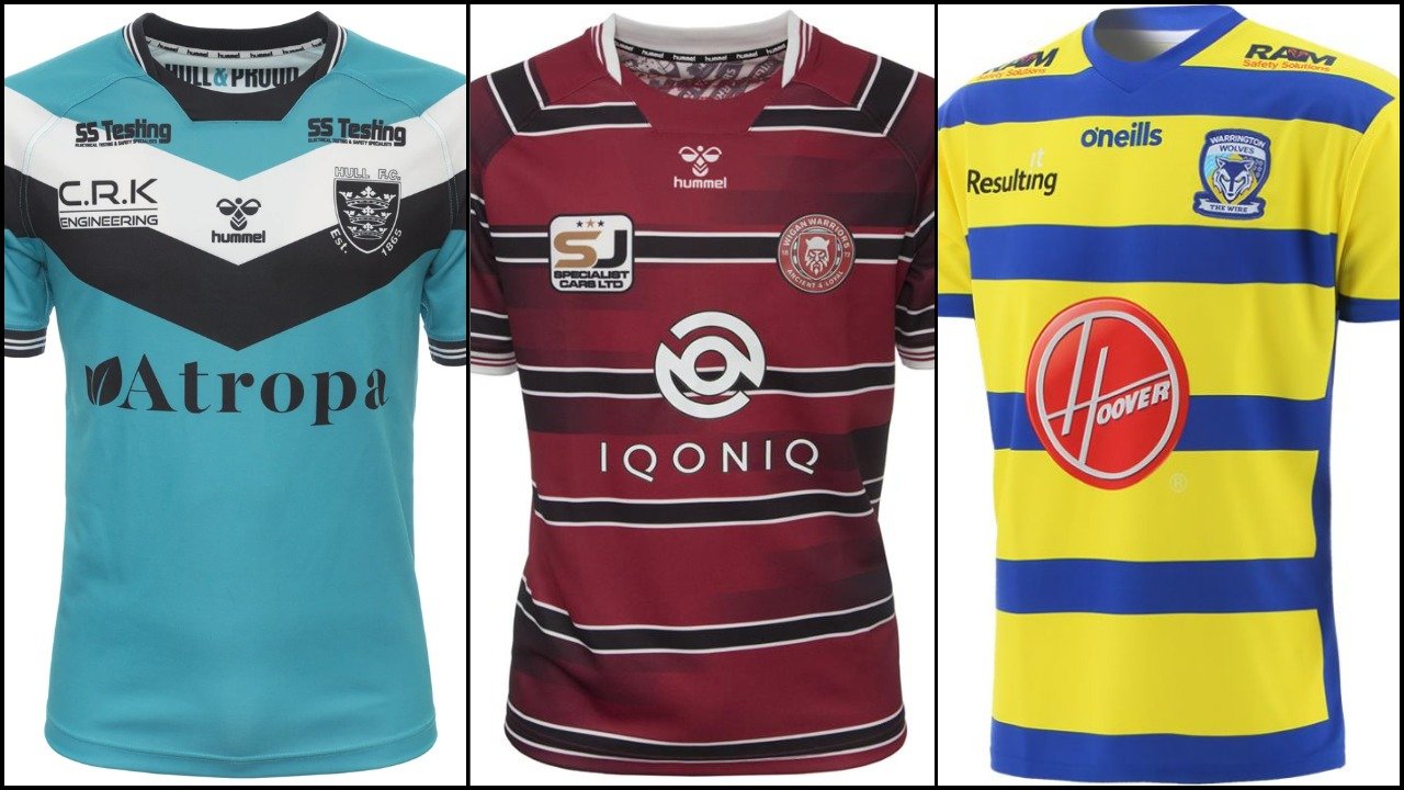
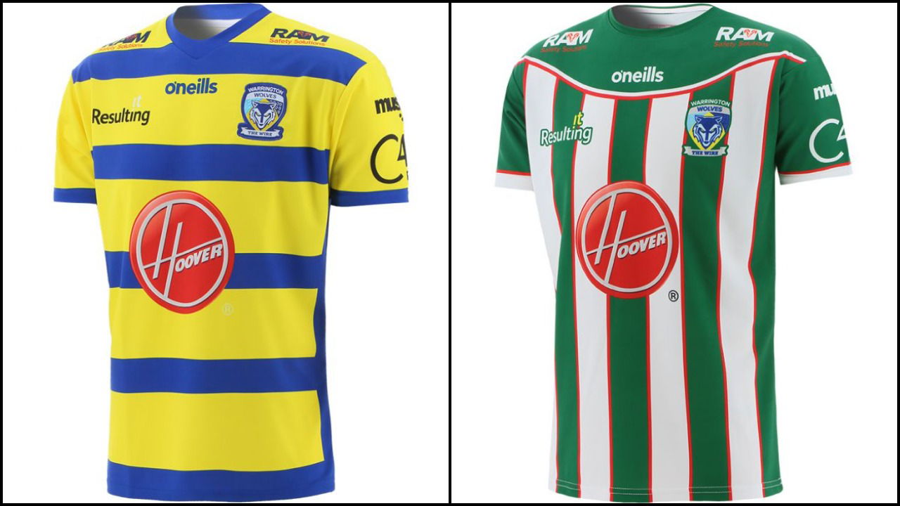
12.) Warrington Wolves
When I mentioned fans scratching their heads at design ideas, I’m through to my skull with this one. First of all, the home kit isn’t actually that bad. But how YELLOW did they want to make it? Placement of the sponsorship badge isn’t ideal, but nothing can really be done about that.
The away kit is a definite left turn for the Wolves and it has not paid off at all. Green?! Why green?! Teams who do not have green as their club colours generally shouldn’t attempt to utilise it to create a successful kit. (One of the only teams who managed to do this well was Whitehaven with their away shirt last season). If it is Warrington’s idea to make Greg Inglis feel somewhat at home in South Sydney colours, then I don’t know whether that makes it better or worse. An awful Warrington shirt.
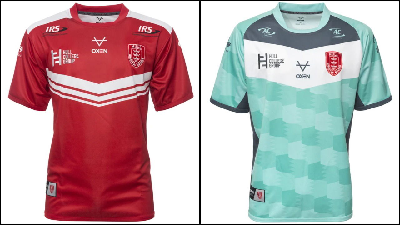
11.) Hull Kingston Rovers
It is difficult for some clubs to keep on redesigning shirts when they have to stay within certain parameters of what is expected of them. This is what Hull KR’s home shirt feels like when you look at it – it looks like someone couldn’t be bothered to design yet another red and white shirt. Instead of the slight ‘V’ stripe on the front it should have been kept as a straight hoop with another one further down the shirt.
The away kit looks washed out and insipid. Darker shades of blue would have been better. The kit may be paying homage to Hull’s maritime heritage with the wave design but it could have come over a lot better than it does.
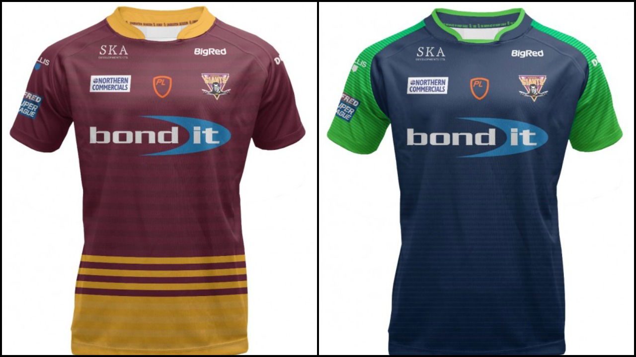
10.) Huddersfield Giants
I actually really like Huddersfield’s home kit for this season. The balance of claret and gold is perfect and the large gold band round the bottom with the three smaller ones above it looks really sharp. If this was a list of just home shirts the Giants would be far higher.
But they have fallen into the ‘green trap’ with the away shirt but instead of it looking mad like Warrington’s, it looks boring. Only using colour on the sleeves is always a lazy design choice, which is a shame given how good the home kit looks.
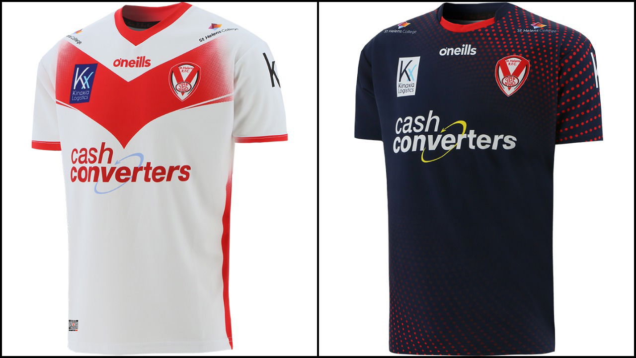
9.) St. Helens
Like Hull KR, Saints are expected to bring out a similar looking shirt as the season before and most of the time they can pull it off. Not this time. Instead of the angular ‘V’ that has dominated many of their shirts, this one looks more akin to the Yorkshire Television logo and doesn’t look anywhere near as good as the home shirt of last year. With not much room for manoeuvre, little details like this are going to be picked up.
The away strip looks more like a training kit than anything. The red dots around the bottom and the shoulders are okay, but they would be better if they weren’t the only design feature on the jersey!
The home and away shirts for this season are no way near good enough for the champions of Super League.
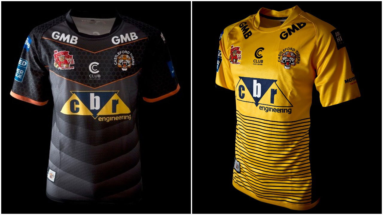
8.) Castleford Tigers
The Tigers are looking to improve upon the problems of last season and they have tried to design a decent pair of shirts to help them do it. But the home shirt looks too dark and oppressive. It also looks like it has been designed to have some form of carbon fibre across the top of it which doesn’t do it any favours. It also doesn’t have enough orange on it for a Tigers home kit. A good away shirt, but not so good for a home one.
The away shirt is much better. In reversal to Huddersfield, if this was a list of away kits, Castleford would be higher. The stripes around the bottom half of the shirt look good but it would have made more sense if there were twenty six stripes and not twenty seven; this is the twenty-sixth season of Super League this year after all. But this minor detail doesn’t matter in a shirt that is good for its purpose.
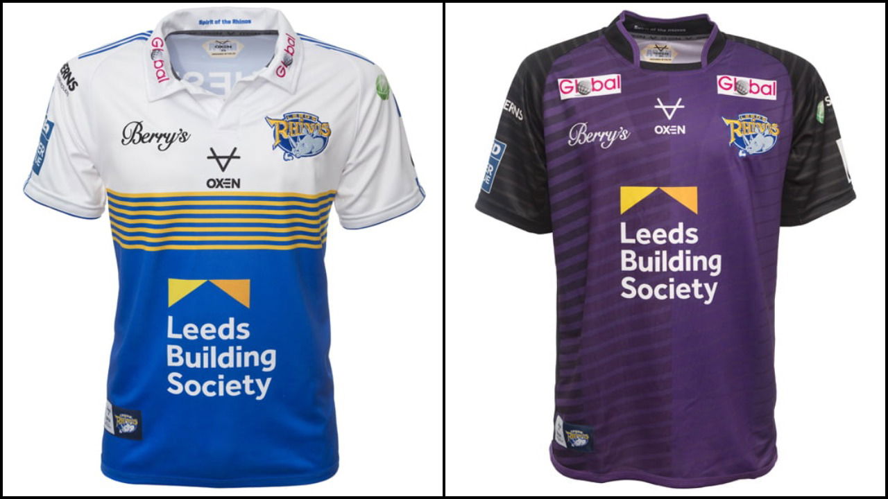
7.) Leeds Rhinos
Rugby League fans got to see the Rhinos new home kit last year in the Challenge Cup Final in respect to Rob Burrow who the shirt is designed for. The seven amber bands separating the blue bottom from the white top represent the No.7 shirt that Burrow wore and it has already been proven to look great on the camera and in person. Dropping the black from last year, Leeds have returned to a more conventional shirt for this season and the old-style of collar typifies this.
The away shirt though falls well below expectations. Like Huddersfield, the sleeves being a different colour to the body are the only design feature and purple is not the right choice. When the shirt was unveiled, some fans thought it was a Melbourne Storm shirt, but I would urge fans to look at the Halifax RLFC kit from last season for a better comparison.
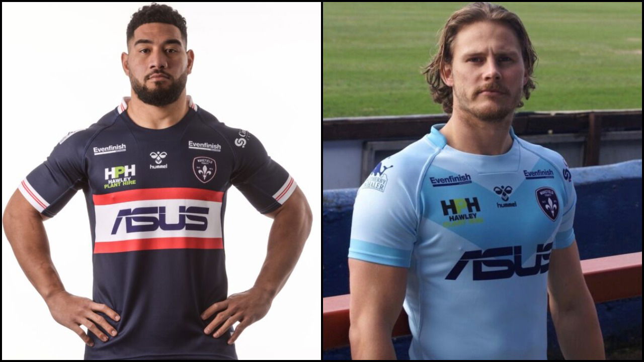
6.) Wakefield Trinity
Wakefield have adopted a simple design this season and it has definitely paid off. Unlike Castleford, the darker home kit for Trinity works much better and it is nice to see a Wakefield home kit that doesn’t have so much white in it. The small red/large white/small red set of bands across the front are a classy design and even though it may not have the flashiness of other shirts, Wakefield’s home strip is still a well designed jersey.
Their away shirt is a better use of muted light blues than Hull KR’s and this is probably because the design is simpler and one that Wakefield knows will work. It has very much paid off for them and I’m looking forward to seeing it on camera.
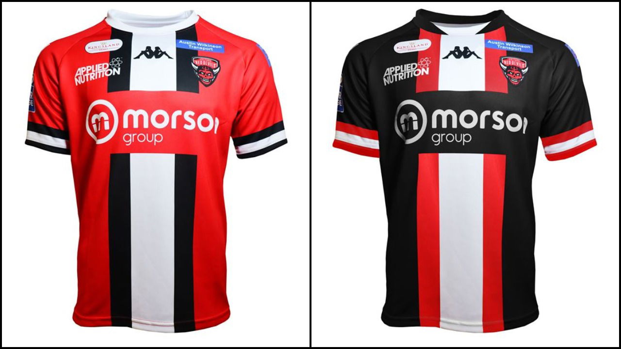
5.) Salford Red Devils
Salford’s home shirt for this year, whilst not as flamboyant as last season, means the Red Devils will definitely not be missed. Bold uses of colour in an unusual design where the main stripe goes straight down the middle instead of across, means the shirt is different to all the other kits this year.
The away kit swaps the red and black around making the black more dominant, which links the two shirts together perfectly. This is something that we don’t get to see often now in Super League and it’s always nice when it happens. The only thing wrong with the shirt is that it has to have that very unfortunate re-branded crest on it!
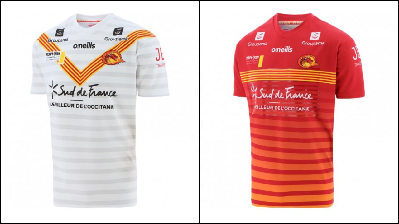
4.) Catalans Dragons
There seems to be some mix up at the Dragons; their home shirt looks like it should be their away shirt and visa-versa! This may have been done as more fans will see the Dragons in their away shirt rather than home, but who knows?
As it is, the ‘V’ on the front of the home shirt is far too narrow for a home shirt. Because of this, not enough red and yellow can be seen and when they are the main club colours, they need to be bolder than they are.
This is where the away kit rescues Catalans. Nothing much can be written about it as it is simply stunning. Or dare I say, it’s…FIRE! Yes, that was shocking, but it cannot be argued that the shirt represents the whole idea of Catalans Dragons very well.
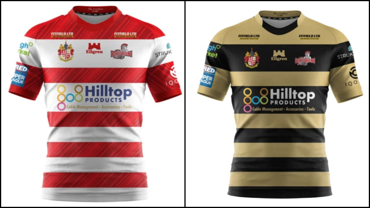
3.) Leigh Centurions
As Wigan have stayed away from cherry and white hoops for the second season in a row now, it is good to see a classic rugby design back and Leigh have done this brilliantly in their return to Super League. The two larger white sections of the strip give clear definition between the top half of the shirt and the bottom, and the number of red bands on the front is well balanced.
Their away kit carries on with the use of black from last season but rather than it being the dominant colour, it is coupled with an unusual colour choice of beige. However, it’s still a well-designed shirt and the colours actually go very well together. Like Wakefield, there is a clearly visible link between both the home and away kits for the Centurions this year.
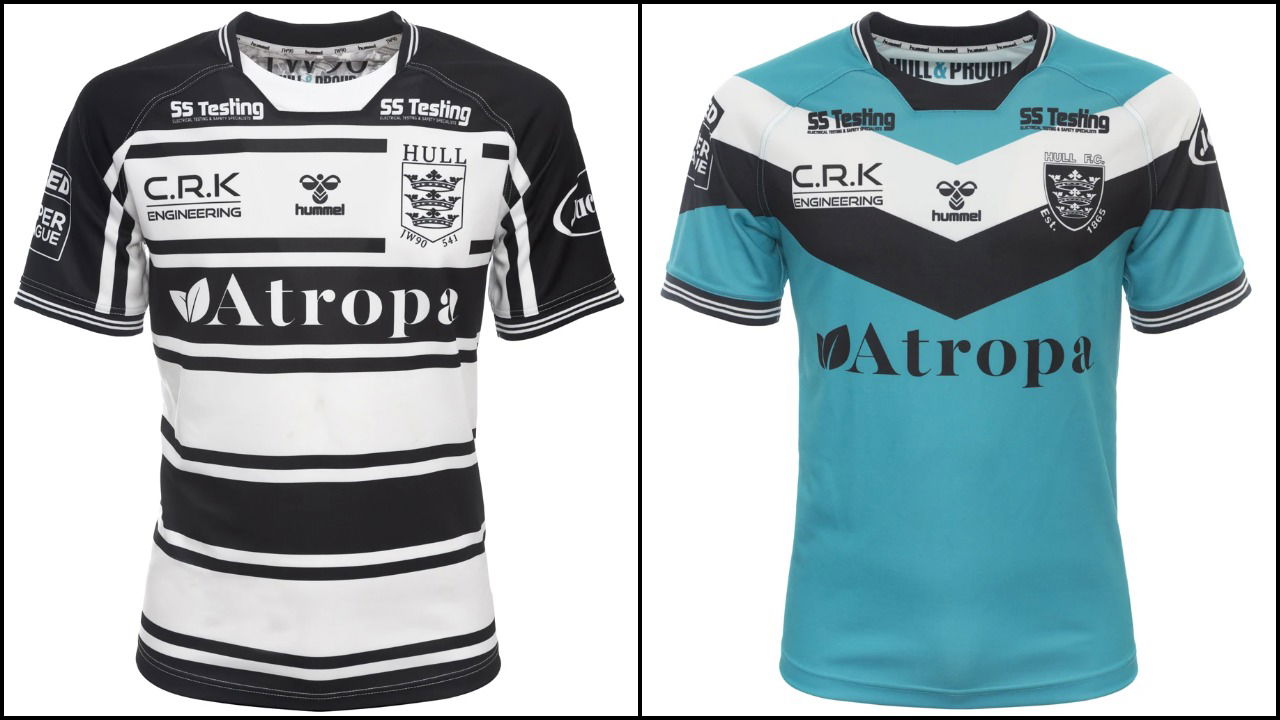
2.) Hull FC
Hull FC usually have a boring home kit and that is not meant in any way disrespectfully. It simply implies that they can’t really do much to shake off the black and white bands that are linked so intrinsically to the club. However, this shirt looks different somehow. It looks far more impactful than other years and the slight re-design of the club crest adds an air of distinction. The design of the bands coupled with the black shoulders and sleeves really do make this shirt effective as a home kit and one that will look fantastic on the pitch and on camera.
The away kit, even though some fans may not like it, is still a success. The departure to a large proportion of blue goes very well with the simple double ‘V’ of black and white so it cannot be mistaken for any other club shirt. The jersey obviously leans a lot on the colour and any other shade of blue wouldn’t have made the shirt look as good. A great choice and kits for the Airlie Birds in 2021.
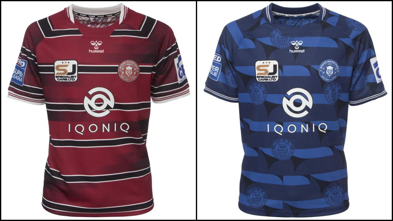
1.) Wigan Warriors
Wigan are out in front here by a country mile. Simplicity in design is effective, hence why Hull FC and Leigh are second and third respectively in this list. But sometimes a shirt is so well designed and different that it trumps a simple design idea. The Warriors have this in spades with both their home and away kits.
The home jersey is definitely not cherry red this year, but that doesn’t matter. The muted, air-brushed detailing bringing the black into the red of the shirt is extremely effective and the lack of white on it also pays off for the Warriors.
The away kit is the biggest departure from the norm this year but it works incredibly well. Two colours of blue in a band design with even better detailing than the home strip, this kit is surely going to be an eye-opener on the field.
3 Comments
Leave a Reply
Leave a Reply


Warrington Wolves
Sam Burgess makes decision on future following South Sydney links

Huddersfield Giants
Jake Connor takes swipe at Leeds Rhinos fans


Jon smith
February 24, 2021 at 11:39 pm
At least do a bit of research before mouthing off on the away Warrington kit… “Why green?” They’ve had plenty of green kits previously.
matthew litherland
February 25, 2021 at 11:35 am
Obviously you know very little about Warrington, the yellow kit is iconic in our history and is a great kit
Jon
February 27, 2021 at 1:08 pm
Well, Rob this was a waste of time reading this article. Have a look at Warrington’s 1991, 1995, 2010 & 2013 away kits and get back to us.