Occasionally, clubs release a kit that makes people sit up and take note – for all the wrong reasons.
From the wacky style to eclectic colours, some jerseys just cannot be taken seriously.
Here are the ten worst kits in Super League history.
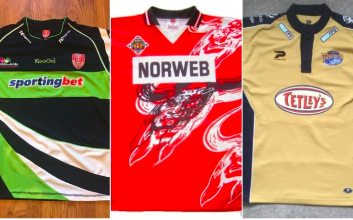
10. Hull KR – 2010 – Away Kit
Hull KR’s 2010 away kit just doesn’t make sense; everything from the colour to the design makes it look as though it was created using Microsoft Paint (other programs are available). The light green seems an afterthought which is a shame because the black and the white do go together well. Unfortunately, one side of the Humber river already lays claim to those two colours which makes the choice even more baffling.
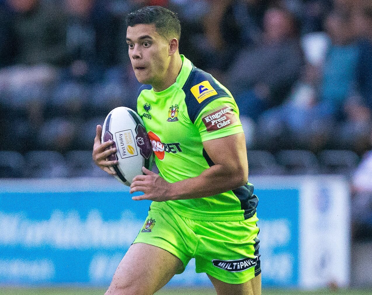
9. Wigan Warriors – 2016 – Third Kit
It wasn’t that long ago, and the repercussions are still being felt about Wigan’s third kit. A luminous green number was the butt of fan jokes up and down the country. But, to be fair, it wasn’t the Warriors that ended with egg on their face as they won six of their seven games when wearing it. One that probably won’t make another appearance.
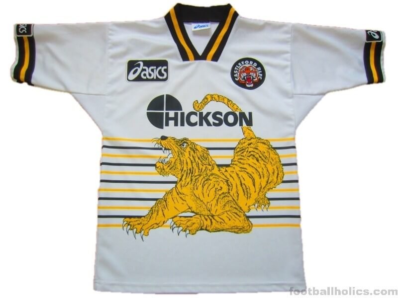
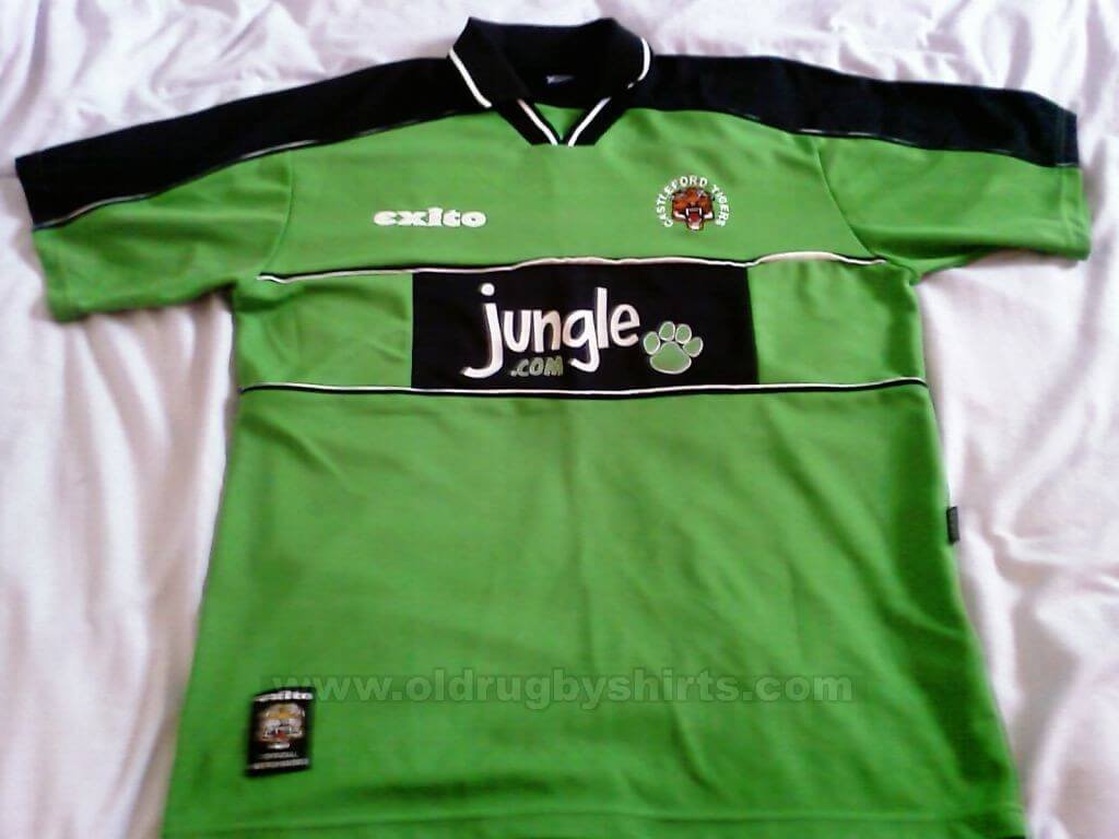
8. Castleford Tigers – 1997 – Away Kit
Castleford have brought out some superb shirts down the years, but the least said about this away abomination from 1997 the better. In fact, without the tiger emblazoned all over the front, it would not have made this list. But, the jungle creature looks like a child’s design – that’s probably being harsh to a child – and the gold colour is just baffling considering the orange and black nature of an actual tiger. There’s little surprise, therefore, that Castleford won just one of their 11 games away from home.
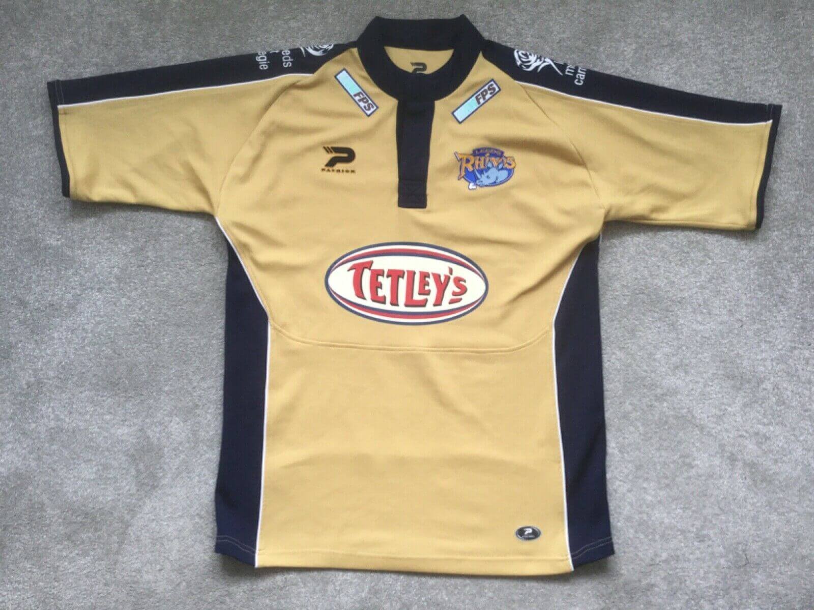
7. Leeds Rhinos – 2005 – Away Kit
The golden away shirt brought out by Leeds in 2005 must have been a bad omen. Losing both the Challenge Cup Final and Grand Final, 2005 was a heartbreaking year for the Rhinos. And, it didn’t get off to the best of starts either; this insipid gold jersey definitely ranks as Leeds’ worst reveals in the Super League era which is a shame considering the club usually hits the money with their kit releases.
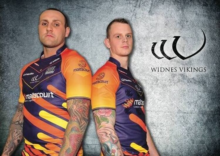
6. Widnes Vikings – 2013 – Away Kit
Some of Widnes’ kits down the line have been great to look at, but this colourful concept from 2013 was not one of those. Deep purple combined with orange and yellow was a change strip that no other club before had thought of – and none since. But, there is a good reason for that: it didn’t look good. Fair play to the Vikings though, the idea was to compliment their sponsors’ house colours for 2013 – logistics company Maltacourt.
5. Castleford Tigers – 2001 – Away Kit
Another Castleford kit, another random design. The shirt itself is rather simple, but the rather outlandish lime green does not really strike you as a Tigers shirt. Including a green jungle paw print on the Jungle.com main sponsor just looks wrong and it’s rather surprising that this ever got passed. Only the Castleford badge looks to belong on this kit, making it one of the most forgettable in recent history.
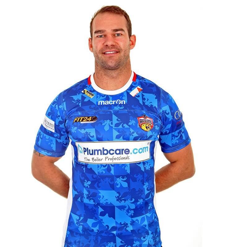
4. Wakefield Trinity – 2015 – Away Kit
You’d almost be blinded taking one look at this Wakefield kit it’s that bright. The light blue is certainly out there, but the incorporation of the fleur de lis into the pattern makes this a mish-mash of different blues and one that simply doesn’t work. The plumbcare.com main sponsor across the front looks seriously out of place too. Not Trinity’s finest hour.
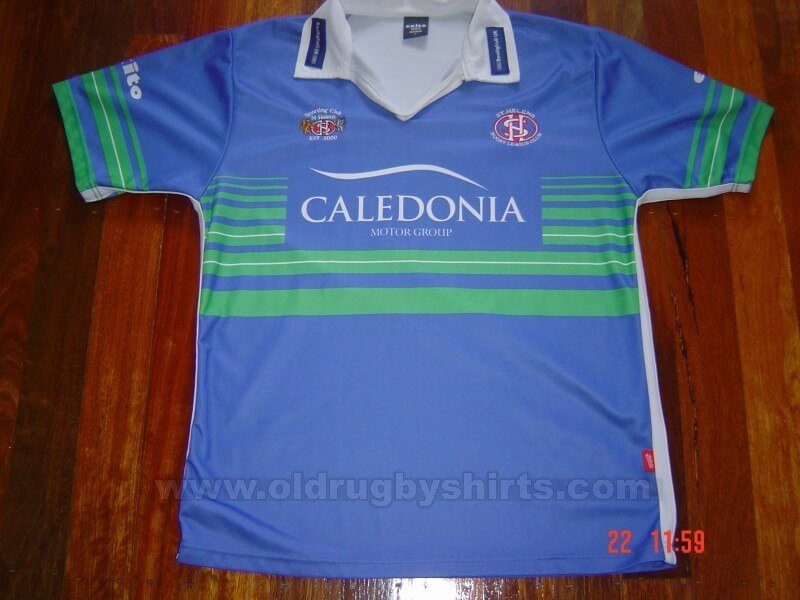
3. St Helens – 2002 – Away Kit
If anything could rival Wakefield’s choice of blue, it’s St Helens’ 2002 delight. The combination of a sickly green and blue really did nothing for a side that won the Super League that year. Not only was the blue-green mix adopted on the front of the shirt, the sleeves were unable to escape the designer’s computer. Of course, turning up in such a tasteless number may well have lulled other teams into a false sense of security before Saints wiped the floor with them.
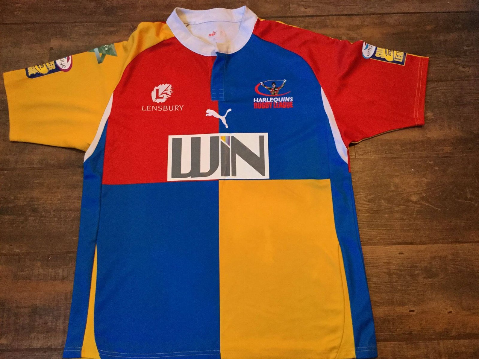
2. Harlequins RL – 2009 – Away Kit
The pattern makes sense – a four block body was synonymous with the Harlequins RL kit scheme and so keeping the quarterly effect on the away kit was a boon. But, the colour was putrid. Two blue panels, one red and one yellow with yellow and red sleeves was colourful to say the least. But, that’s as positive it can get for the design process. Not really one you would frame or just want to look at for more than a second or two.
1. Wigan Warriors – 1997 – Home Kit
Another jersey from 1997 and for the second time it is Wigan that bears the embarrassment. Made by Puma, the German manufacturer did not exactly consider the reception it would get when thinking about what to include and what to leave out. The presence of a Warrior illustration on the front is still talked about today with the design probably one best left in the bin. For the Warrior reason alone, this takes top spot.


Super League Disciplinary News
Super League Disciplinary: England international appeals charge


Leigh Leopards
Reports: Leigh Leopards exit could lead to huge signing