Salford have revealed a new club badge and brand that will see a reincarnation of the Red Devil logo.
The club begun work on rebranding in 2019 and the new crest comes as a result of consultation with supporters, sponsors and other major stakeholders.
One of the main new features is the return of the Devil to the badge – an element desired by the majority of supporters – while a shield and trident are also incorporated.
The badge itself will feature on the Red Devils’ kit from 2021, while merchandise featuring it has already gone on sale.
Salford Red Devils managing director Paul King said: “In consultation with major stakeholders, Super League clubs have recognised a need to change the manner in which the sport presents itself, which aligned with our personal intentions to be fresher and appeal to a younger demographic.
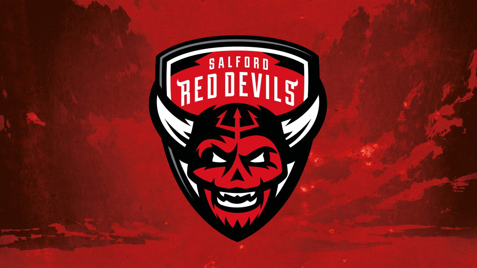
Salford have revealed a new brand identity, including this new club crest. Credit: Salford Red Devils
“Our new brand is perfectly suited to digital environments and will help us access alternative income streams, by developing our own white label retail range, which utilises the constituent parts of the logo to appeal to a broad range of new and existing fans.
“The feedback from our supporters was integral to our realisation of this new identity, with them requesting a return of the devil to our badge above all else, when asked their thoughts on the Club’s image.
“As someone who grew up hearing stories about the original Red Devils, I am delighted to see our dear friend resurrected.”
Lifelong Salford supporter and creative director of the new brand Andy Roberts added: “I’ve been privileged to work in the sports branding industry for over 15yrs, so to be given this project for the team I’ve supported for 35yrs, was a dream come true and an absolute honour for me.
“I’ve pitched some ideas to the club over the years but thanks to Paul King, with our visions aligned, it was the perfect time to work together.
👹 𝗥𝗘𝗦𝗨𝗥𝗥𝗘𝗖𝗧𝗘𝗗!
👊 The Devil is back!
💪 #TogetherStronger pic.twitter.com/BXQj9dUAnp
— Salford Red Devils (@SalfordDevils) November 13, 2020
“Previous logo changes have always lacked clear brand direction. Old logos were too busy and featured too many colours, making them difficult to reproduce, both digitally and financially.”
“Inspiration was drawn from the most successfully marketed sporting organisations, including the NFL, NBA, NHL and NRL. Now is the time to move our great club into that space, with a new, iconic brand.
“Our ambition was to create a new iconic devil, a digital first brand, used to attract the next generation of fans to Salford, whilst giving existing fans an identity to be proud of for generations to come.”
